Instagram posts
38 pieces · 228 votes
Opus41%
Sol67%
Gemini42%
50%: even
Marketing eval · v1
Social posts
GPT-6.2 Sol
Won 67% of its Instagram votes and 65% on X.
Meta ads
Claude Opus 5.5
Won 64% of its ad votes.
YouTube packaging
Gemini 4 Neon
Won 61% of its title-and-thumbnail votes.
Deep work
Sol&Opus
Tied at the top on pages, emails, positioning, plans and ads. Gemini trails.
Video ads
Gemini 4 Neon
Won 75% of its votes, with the same video model for all three.
Copywriting
Sol&Opus
The council leans Sol (57%); judges from outside the race lean Opus (66%).
Search
Sol&Gemini
Keyword plans and pages to rank, from real search data. Opus trails.
Video editing
Claude Opus 5.5
Won 77% of its edit votes.
GPT-6.2 Sol won the most votes across 15 marketing jobs (58% on average, against Opus 52% and Gemini 40%), and it cost the least ($0.04 a piece). No model won everything: Opus leads video editing and rewrites; Gemini leads video ads and search ads. And the brands’ own best work still beat all three most of the time.
Social posts, ads and YouTube · 35 brands
All three are statistically tied overall: their 95% ranges overlap, so each could rank anywhere from 1 to 3.
660 blind votes between the models. Each pair was judged in both orders by the two judges from the labs not in it. Bradley-Terry rating, 1000 is average; the bars are 95% ranges from resampling the jobs.
Quality against cost
Each small dot is one model on one job: how often its work won the blind votes, against what it cost to make one piece at high reasoning effort. The big dots are each model’s average across all 15 jobs. Up and to the left is better. Video ads also pay the same $0.96 a clip to the video model for every model, which isn’t counted here.
| Job | Opus | Sol | Gemini |
|---|---|---|---|
| Landing pages | 62% · $0.170 | 56% · $0.071 | 31% · $0.269 |
| Welcome emails | 62% · $0.063 | 69% · $0.020 | 19% · $0.100 |
| Positioning briefs | 66% · $0.070 | 75% · $0.018 | 9% · $0.152 |
| Campaign plans | 50% · $0.105 | 91% · $0.033 | 9% · $0.160 |
| Video ads | 47% · $0.054 | 28% · $0.024 | 75% · $0.134 |
| Carousel ads | 38% · $0.146 | 56% · $0.085 | 56% · $0.314 |
| Long sales pages | 36% · $0.082 | 78% · $0.021 | 35% · $0.149 |
| 10 headlines | 59% · $0.051 | 51% · $0.018 | 40% · $0.094 |
| Google search ads | 42% · $0.053 | 38% · $0.023 | 70% · $0.219 |
| Cold emails | 52% · $0.035 | 92% · $0.012 | 6% · $0.077 |
| Product descriptions | 54% · $0.036 | 40% · $0.010 | 56% · $0.096 |
| Rewriting a real flop | 66% · $0.028 | 53% · $0.012 | 31% · $0.055 |
| Keyword plans | 23% · $0.106 | 62% · $0.034 | 64% · $0.212 |
| Pages to rank | 50% · $0.150 | 52% · $0.032 | 48% · $0.212 |
| Video edits | 77% · $0.292 | 23% · $0.154 | 50% · $0.921 |
By channel
Share of the votes each model won against the other two. The whiskers are 95% ranges; past the 50% line means it beat the field.
38 pieces · 228 votes
50%: even
16 pieces · 96 votes
50%: even
22 pieces · 132 votes
50%: even
34 pieces · 204 votes
50%: even
Deep work · pages, emails, positioning, plans, video and carousel ads
For 8 of the brands (Notion, Figma, Zapier, ElevenLabs, Ridge, Solo Stove, Kosas, WHOOP), each model also built a landing page, a 3-email welcome sequence, a positioning brief, a 30-day campaign plan on a $50,000 budget, an 8-second Reels ad and an Instagram carousel ad. All three ran at high reasoning effort. Pages and slides were rendered and judged from screenshots plus their text. Every video ad was made by the same video model (Google Veo 3.1 Fast) from the model’s own prompt and judged from 9 frames, the words on screen and what’s said.
288 blind votes, judged the same way as the creative. The shorter piece won 55% of decided votes, so we checked whether length explains the ranking. It doesn’t: holding length equal (the way LMArena’s style control does) widens the lead, to Sol 1144, Opus 1014, Gemini 842.
8 brands · 48 votes
50%: even
8 brands · 48 votes
50%: even
8 brands · 48 votes
50%: even
8 brands · 48 votes
50%: even
8 brands · 48 votes
50%: even
8 brands · 48 votes
50%: even
Landing page · Figma
A typical job: of the 8 brands, the one whose result is closest to the result across all of them (Opus 62%, Sol 56%, Gemini 31%).
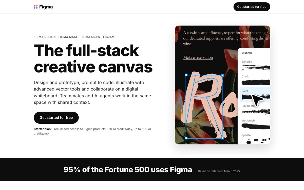
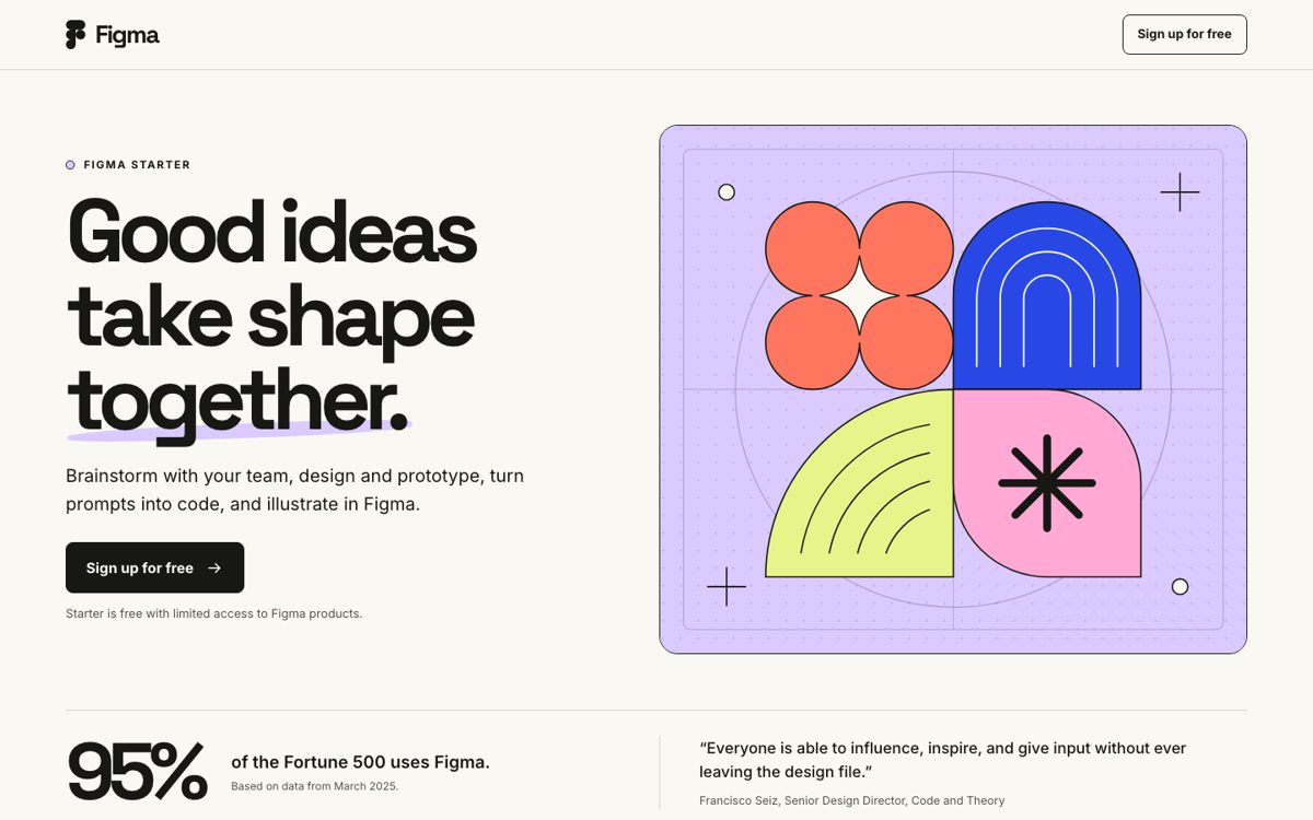
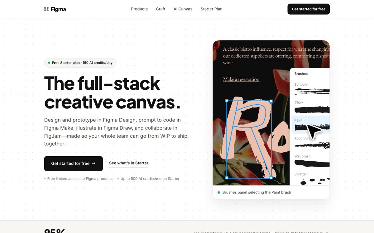
“A puts its Fortune 500 proof in the first laptop screen and keeps a free-signup button within thumb’s reach on mobile, without B’s distractions from community resources and paid plans.”
Build the landing page for Figma (Figma Design, Figma Make, Figma Draw and FigJam). Visitors arrive cold from a paid social ad. The page has one goal: get them to sign up for the free Starter plan.
Deliver one complete, self-contained HTML file: inline CSS, Google Fonts allowed, no other external files, scripts or icon libraries. It must work on a phone and on a laptop. Buttons link to "#"; the real link is added later.
Images: you may use only these photos of the real product, by exact file name, or none:
- ref-1.jpg: Brushes panel with cursor selecting the Paint brush
- ref-2.jpg: Pen tool editing vector path anchor points
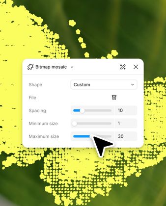
- ref-3.jpg: Bitmap mosaic panel with spacing and size controls
Don't draw, mock up or describe product screens or photos that aren't in these files.

Everything known about Figma (public facts, as of November 19, 2026):

--- brief.md ---
# Figma (real brand; public facts as of 2026-11-19)

Website: figma.com. Facts below come from the brand's own site, each with the exact words it says.

## What they sell

- Figma Design is for designing and prototyping in one place. ("Design and prototype in one place")
- Figma Make turns prompts into code. ("Prompt to code anything you can imagine")
- Figma Weave covers AI workflows for imagery, video, audio, and more. ("AI workflows for imagery, video, audio, and more")
- FigJam is a collaborative digital whiteboard. ("Collaborate with a digital whiteboard")
- Figma Draw is for illustration with advanced vector tools. ("Illustrate with advanced vector tools")
- The Starter plan is free with limited access to Figma products. ("Free limited access to Figma products")
- Professional includes advanced Dev Mode inspection and an MCP Server. ("Advanced Dev Mode inspection and MCP Server")

## Who it's for (their words)

- Figma is made so a whole team can go from work in progress to ship together. ("Made so your whole team can go from WIP to ship, together.")
- Teammates and AI agents are meant to work in the same space. ("Teammates and AI agents work in the same space with shared context.")
- Professional is for a professional working solo or with others. ("Are a professional working solo or with others")
- Organization is for a business that designs products across the organization. ("Are a business that designs products across your organization")
- Enterprise is for a business designing for multiple products or brands. ("Are a business designing for multiple products or brands")
- Organization buyers may want to centralize assets, libraries, and workflows across departments. ("Want to centralize assets, libraries, and workflows across departments")

## Proof they publish

- 95% of the Fortune 500 uses Figma. ("95% of the Fortune 500 uses Figma")
- The Fortune 500 figure is based on data from March 2025. ("Based on data from March 2025.")
- Figma says the products you love are designed in Figma. ("The products you love are designed in Figma")
- Francisco Seiz is quoted as Senior Design Director at Code and Theory. ("Senior Design Director, Code and Theory")
- A Code and Theory design director says people can give input without leaving the design file. ("Everyone is able to influence, inspire, and give input without ever leaving the design file.")
- Figma points visitors to customer stories about leading product teams. ("Read about leading product teams")

## Offers

- Starter is a free tier with limited access to Figma products. ("Free limited access to Figma products")
- Starter includes 150 AI credits a day, up to 500 AI credits a month. ("150 AI credits/day, up to 500 AI credits/mo")
- On a paid plan, others can view and comment without extra seats. ("If you're on a paid plan, you can let others view and comment on your files without purchasing extra seats.")

## Sources

- https://figma.com/
- https://www.figma.com/pricing/

--- site.md ---
[474 words of Figma’s homepage text, copied from figma.com on November 19, 2026. Left out of this page because it’s the brand’s own copy.]

--- reviews.md ---
[8 real customer reviews, word for word and cut at 60 words, from Trustpilot. Left out of this page because they’re the customers’ words.]


Rules for this job:
- Anything said about Figma or its products uses only the facts below: no invented numbers, prices, offers, features, customers, quotes, reviews, awards or dates, and facts kept exact.
- Return only the fields asked for.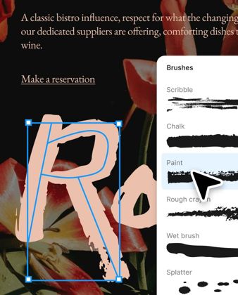

Two landing pages for Figma (Figma Design, Figma Make, Figma Draw and FigJam). Visitors arrive cold from a paid social ad, and the page's one goal is to get them to sign up for the free Starter plan. You see each page on a laptop (its first screens) and on a phone, plus its full text. Which page would get more visitors to sign up for the free Starter plan? Answer A or B; say tie only if you truly can't separate them. One sentence on why.

[Then each page: its full text, 3 laptop screens and 2 phone screens.]
| Judge | Shown as A | Shown as B | Picked | Why, in the judge’s words |
|---|---|---|---|---|
| Claude Fable 5.2 | Gemini | Sol | Sol | B is a short, focused page with a single clear action, a plain-language benefit headline, and proof visible in the first screen, while A is long, repeats itself, adds nav links and paid-plan details that distract a cold visitor from the free signup. |
| Claude Fable 5.2 | Sol | Gemini | Sol | A is a tight, single-purpose page with one repeated CTA, visible proof right under the hero and no nav or paid-plan detours, whereas B's nav links, secondary CTA, long scroll and paid-plan section dilute a cold visitor's path to the free signup. |
| GPT-6.2 Astra | Gemini | Opus | Opus | B gives cold visitors one clear next step, reinforces it with prominent Fortune 500 social proof, and keeps free signup within thumb’s reach as they scroll on mobile. |
| GPT-6.2 Astra | Opus | Gemini | Opus | A puts its Fortune 500 proof in the first laptop screen and keeps a free-signup button within thumb’s reach on mobile, without B’s distractions from community resources and paid plans. |
| Gemini 4 Carbon | Sol | Opus | Sol | Page A looks authentically like Figma, communicates the four-product Starter offer and Fortune 500 social proof concisely right at the top, and avoids Page B's generic logo, repetitive triple mobile CTAs, and illustration-only visuals. |
| Gemini 4 Carbon | Opus | Sol | Opus | Page A shows real product UI instead of abstract geometric shapes, states a more concrete value proposition upfront, and keeps sign-up CTAs persistently visible as visitors scroll on both desktop and mobile. |
Video ad · Ridge
A typical job: of the 8 brands, the one whose result is closest to the result across all of them (Gemini 75%, Opus 47%, Sol 28%).
Slim, RFID-blocking, guaranteed for life. Black Friday: up to 50% off Ridge Wallets, with a 99-day risk-free trial.
Ridge Wallets: Up to 50% Off · [Shop now]
Black Friday: Up to 50% off Ridge Wallets. Slim, RFID-blocking, guaranteed for life. 99-day risk-free trial & free shipping.
Ridge Wallets: Up to 50% Off · [Shop now]
Swap the bulk for a slim, RFID-blocking Ridge Wallet. Try it risk-free for 99 days.
Up to 50% off Ridge Wallets · [Shop now]
“Ad B shows hands holding the wallet and sliding cards out so unfamiliar viewers immediately see its size and how it works, while also highlighting the 99-day risk-free trial and free shipping on screen, whereas Ad A never demonstrates the wallet in use and morphs into a distorted product labeled "3DDGEE" for the second half of the clip.”
Make an 8-second vertical video ad for the Ridge Wallet, for Instagram Reels and Facebook, shown to people who don't know Ridge. Its one goal: get them to buy a Ridge Wallet.

How it gets made (the same for every marketer in this test):
- The footage comes from a video model, Google Veo 3.1 Fast, from your prompt: one continuous 8-second clip, 1080x1920 (9:16), with sound. You write the prompt.
- You may start the clip from one of the brand's real photos below: the clip then opens on that exact image (fitted into the 9:16 frame) and moves from there. Or start from nothing.
- The video model draws words, logos and screens badly, so don't ask it for any text on screen. Words on screen are added afterwards, in code, from your overlays: up to 4 lines of up to 8 words each, with when each one shows (in seconds, 0 to 8) and where (the top, middle or bottom of the frame, all inside the Reels safe area), set in white bold type on a dark band.
- Any line spoken in the clip goes in double quotes in your prompt, with who says it and how; it is spoken as written. Leave speech out if you want none. Say what sounds you want.
- Reels and Feed autoplay muted, so the ad has to work with the sound off too.
- Around the video the ad shows your primary text, a headline and a button.
The brand's real photos, by exact file name:
- ref-1.jpg: Two gunmetal Ridge wallets on a white background
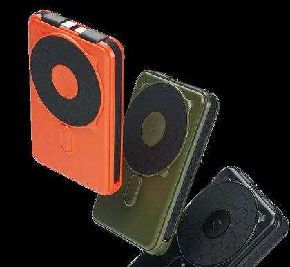
- ref-2.jpg: Orange, olive, and black Ridge magnetic wallets
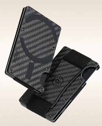
- ref-3.jpg: Carbon-fiber Ridge wallets with elastic cash straps
Don't ask the video model for product details, colors or screens that aren't in these photos or the facts.

Everything known about Ridge (public facts, as of November 19, 2026):

--- brief.md ---
# Ridge (real brand; public facts as of 2026-11-19)

Website: ridge.com. Facts below come from the brand's own site, each with the exact words it says.

## What they sell

- Ridge wallets are slim, RFID-blocking, and guaranteed for life. ("Slim, RFID-blocking, Guaranteed for Life")
- Power banks offer 5-in-1 power, MagSafe readiness, and built-in cables. ("5-in-1 Power, MagSafe-ready, cables built in.")
- Hardshell luggage is weatherproof, rugged, and travel-ready. ("Weatherproof, rugged build and travel-ready.")
- Men's rings have a premium build with a lifetime guarantee. ("Premium build, lifetime guarantee included")
- Ridge sells a 24 oz water bottle engineered to outlast. ("Ridge 24 oz Water Bottle Engineered To Outlast")
- MagSafe wallets are described as next-level compatible. ("MagSafe® Wallet Next Level Compatible")
- Vacuum packing sets are sold to fit more in the same bag. ("Vacuum Packing Sets Same Bag, More Room")

## Who it's for (their words)

- The brand speaks to guys as gift recipients. ("For every guy on the list")
- Products are positioned as gear used every day. ("The gear you rely on every day")
- Women's wallets are framed as premium everyday gear. ("Women's Wallets Premium Everyday Gear")
- Men's rings are built for life. ("Men's Rings Built For Life")
- Ridge offers bulk and corporate orders. ("Bulk & Corporate Orders Personal Touch. Premium Gear.")
- Backpacks and bags are purpose-built for adventure. ("Backpack & Bags Purpose-Built For Adventure")

## Offers

- Shoppers can return an item for a full refund if it is not as promised. ("Live with it. If it's not everything we promised, return it for a full refund.")
- Products are backed by a lifetime warranty. ("Made to last, backed by a promise that never fades.")
- Shipping is fast and free, with no added fees. ("Delivered swiftly, carefully, and without added fees.")
- Gear is guaranteed for life. ("Overbuilt. Guaranteed for life. Used every day.")

## Sources

- https://ridge.com/
- https://ridge.com/products/magnetic-power-bank-matte-black

--- site.md ---
[440 words of Ridge’s homepage text, copied from ridge.com on November 19, 2026. Left out of this page because it’s the brand’s own copy.]

--- reviews.md ---
[2 real customer reviews, word for word and cut at 60 words, from Trustpilot. Left out of this page because they’re the customers’ words.]


Rules for this job:
- Anything said about Ridge or its products uses only the facts below: no invented numbers, prices, offers, features, customers, quotes, reviews, awards or dates, and facts kept exact.
- No one in the ad poses as a customer, gives a review or testimonial, or shows results they got; reviews may be quoted only word for word from the facts.
- Return only the fields asked for.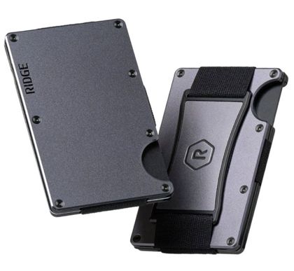
Claude Opus 5.5: starts from ref-1.jpg
Vertical 9:16 product commercial, one continuous 8-second shot. Open on the exact starting image: two gunmetal aluminum card-holder wallets on a clean white background, one showing its flat front plate, the other its back with a black elastic strap and a metal clip. Keep both wallets exactly as in the photo: same gunmetal finish, same screws, same thumb cutout, same black elastic. Do not add any new colors, parts, text or logos. 0-3s: the camera pushes in slowly and smoothly while a soft studio light sweeps across the brushed metal, making a crisp highlight glide over the edges. 3-6s: a man's hand enters from the right, picks up the front-facing wallet and pushes his thumb through the cutout, fanning out a short stack of plain blank cards with no printing, showing how thin the whole wallet is. 6-8s: he slides the cards back in with a satisfying snap and holds the slim wallet up toward the camera against the white background, the second wallet resting in soft focus behind. Bright, premium, minimal lighting, shallow depth of field, sharp detail, no text anywhere in the frame. Sound: a low, modern bass pulse building under the shot, a soft whoosh as the light sweeps, a crisp metallic click as the cards fan out, and a clean snap when they slide back in. No speech, no voiceover.

Words on screen (added in code):
0–2.8s, top: Ditch the bulky wallet.
2.8–5.5s, bottom: Slim. RFID-blocking. Guaranteed for life.
5.5–8s, top: Black Friday: up to 50% off
5.5–8s, bottom: 99-day risk-free trial. Fast, free shipping.
Gemini 4 Neon: starts from ref-1.jpg
Continuous 8-second vertical 9:16 commercial product video in crisp natural daylight, opening directly on the exact overhead frame of the two gunmetal Ridge wallets resting on a seamless bright white matte tabletop. Within the first second, a man's hand enters smoothly from the right and lifts the left gunmetal wallet while the camera glides continuously down from overhead into an intimate eye-level macro close-up, revealing a softly blurred sunlit modern room behind it. From 1.5 to 4 seconds, the hand turns the gunmetal wallet sideways to highlight its slim profile and beveled metallic edges catching clean highlights, then presses a thumb against the side semicircular notch so a neat stack of plain unbranded matte black and dark gray cards smoothly fans upward out of the plates before snapping back flush. From 4 to 6 seconds, the hand flips the wallet effortlessly to show the black elastic cash strap and gunmetal center plate on the back securing neatly folded plain paper bills. From 6 to 8 seconds, the camera tracks gently downward as the hand slides the slim gunmetal wallet smoothly into the front pocket of dark charcoal trousers, resting completely flat with no bulge. Smooth, stabilized cinematic handheld motion, shallow depth of field, sharp focus on the metallic texture and screws. Do not add any on-screen text, captions, watermarks, or graphics. Sound design: subtle crisp metallic brush as the wallet lifts, clean tactile card-sliding whisper and soft click as the cards snap flush, gentle fabric rustle as the wallet glides into the pocket, underscored by a minimal modern rhythmic pulse. A calm, confident male commercial narrator speaks in a warm, steady voiceover: "Meet the Ridge Wallet. Slim, RFID-blocking, and guaranteed for life. Shop Black Friday now—up to 50% off."

Words on screen (added in code):
0–2s, top: Meet the Ridge Wallet
2–4.2s, bottom: Slim. RFID-blocking. Guaranteed for life.
4.2–6.2s, bottom: 99-day risk-free trial. Fast, free shipping.
6.2–8s, top: Black Friday: Up to 50% off
GPT-6.2 Sol: starts from ref-1.jpg
Create one continuous 8-second product shot at 1080x1920 (9:16) with sound. Open on the exact supplied photo, fitting both gunmetal Ridge Wallets into the vertical frame against seamless white. Immediately push in and glide through a shallow side arc. From 1.5 to 3.3 seconds, let a narrow highlight travel along the front wallet’s thin edge so its slim profile is easy to see. Ease back to a wider three-quarter view with both wallets centered by 5.2 seconds, then hold that composition through the end. Keep the wallets fixed relative to each other and faithful to the photo: no changes to their shape, finish, hardware, or existing markings. Leave clean white space above them for post-production overlays. No cuts, hands, props, generated text, or added logos. Sound: a crisp tick on the opening move, a soft swish on the arc, and a minimal percussive beat. No speech.

Words on screen (added in code):
0–1.5s, top: Still carrying a bulky wallet?
1.5–3.3s, top: Meet the slim Ridge Wallet
3.3–5.2s, top: Guaranteed for life
5.2–8s, top: Black Friday: Up to 50% off
Two 8-second vertical video ads for the Ridge Wallet, for Instagram Reels and Facebook, shown to people who don't know Ridge. Each one's goal is to get them to buy a Ridge Wallet. For each you see 9 frames of the finished ad (0 to 8 seconds, with its words on screen), what's said in it, and the text shown around it. Most people watch with the sound off. Which ad would get more people to buy a Ridge Wallet? Answer A or B; say tie only if you truly can't separate them. One sentence on why.

[Then each ad: its words on screen with their timings, what’s said (transcribed by Thinking Machines’ Inkling and checked by Qwen, labs that aren’t competing), the text around it, and 9 frames.]
| Judge | Shown as A | Shown as B | Picked | Why, in the judge’s words |
|---|---|---|---|---|
| Claude Fable 5.2 | Gemini | Sol | Gemini | A shows the wallet in a hand, holding cash and sliding into a pocket, with clear benefits, risk-free trial and offer on screen, while B's question hook is undercut by static, glitchy product renders including a garbled "EDDGEE" logo that looks fake and gives no sense of real use. |
| Claude Fable 5.2 | Sol | Gemini | Gemini | B shows the wallet in a real hand, holding cash and sliding into a pocket, with clear benefit and risk-reversal captions, while A is a static product shot on white that morphs into a garbled, misbranded "EDDGEE" wallet that undermines trust. |
| GPT-6.2 Astra | Gemini | Opus | Opus | “Ditch the bulky wallet” gives viewers who don’t know Ridge a reason to switch, and showing the discount alongside the risk-free trial gives them a reason to buy now, even with the sound off. |
| GPT-6.2 Astra | Opus | Gemini | Gemini | B shows the wallet holding cards and cash and slipping into a front pocket, so even first-time viewers watching on mute can see why its slim design matters. |
| Gemini 4 Carbon | Sol | Opus | Opus | Ad B shows hands holding the wallet and sliding cards out so unfamiliar viewers immediately see its size and how it works, while also highlighting the 99-day risk-free trial and free shipping on screen, whereas Ad A never demonstrates the wallet in use and morphs into a distorted product labeled "3DDGEE" for the second half of the clip. |
| Gemini 4 Carbon | Opus | Sol | Opus | Ad A demonstrates how the wallet fits in the hand and holds cards while highlighting key purchase incentives like free shipping and a 99-day trial on screen, whereas Ad B spends its entire second half on a static, AI-warped image prominently misspelled as "3DDGEE" that undermines trust with new customers. |
For the software brands the models only had still screenshots of the product to start from, and the video model can’t draw software screens, so most of those clips are abstract motion with words on top. The motion-ads rules in the skills call for a real screen recording for software; this test didn’t have one.
ElevenLabs · software
Figma · software
Kosas · physical product
Notion · software
Ridge · physical product
Solo Stove · physical product
WHOOP · physical product
Zapier · software
Carousel ad · Kosas
A typical job: of the 8 brands, the one whose result is closest to the result across all of them (Sol 56%, Gemini 56%, Opus 38%).
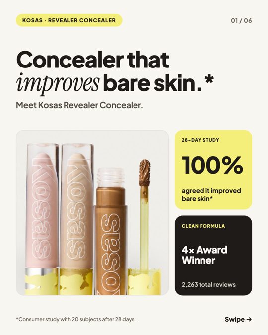
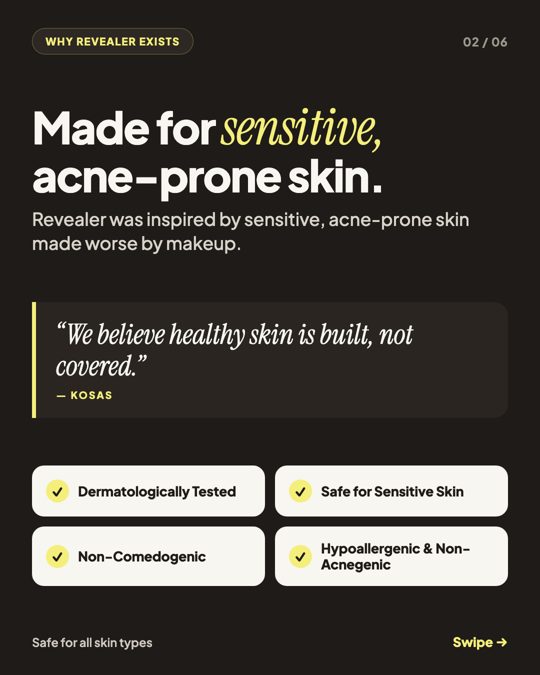
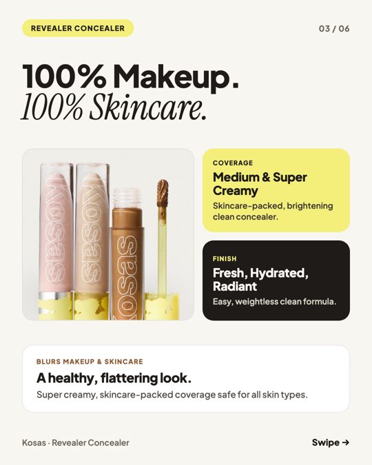
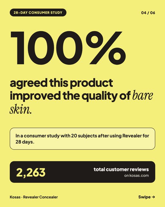
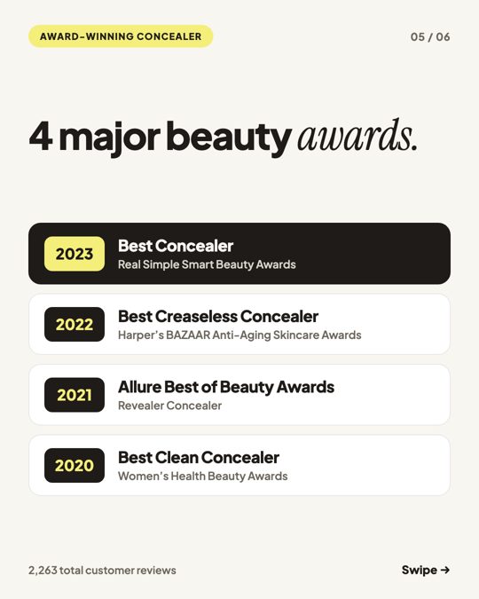
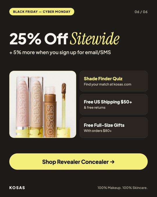
Concealer that improves bare skin.* Meet Kosas Revealer Concealer—now 25% off sitewide for Black Friday & Cyber Monday. Super creamy, skincare-packed medium coverage with a fresh, hydrated, radiant finish. Dermatologically tested, hypoallergenic, non-comedogenic, non-acnegenic, and safe for sensitive skin. *100% agreed it improved the quality of bare skin in a 28-day consumer study of 20 subjects. Take the Shade Finder Quiz at kosas.com. Free shipping on US orders $50+ & free returns.
Kosas Revealer Concealer — 25% Off · [Shop now]
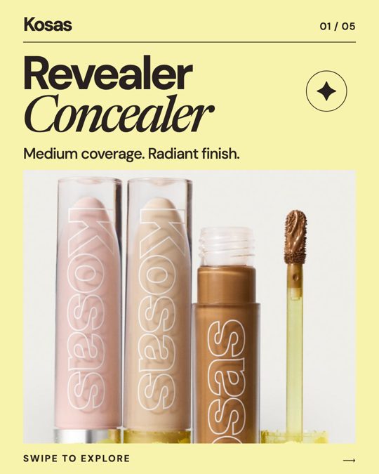
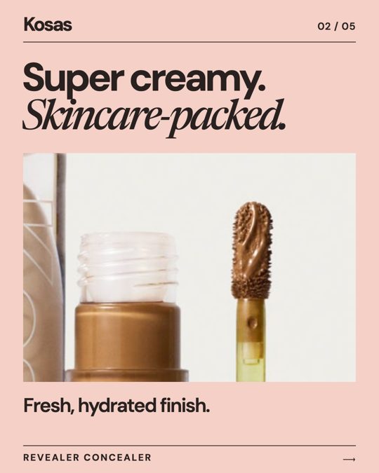
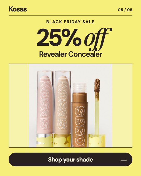
Meet Kosas Revealer Concealer: medium coverage with a radiant finish. Get 25% off during the Black Friday Sale.
25% Off Revealer Concealer · [Shop now]
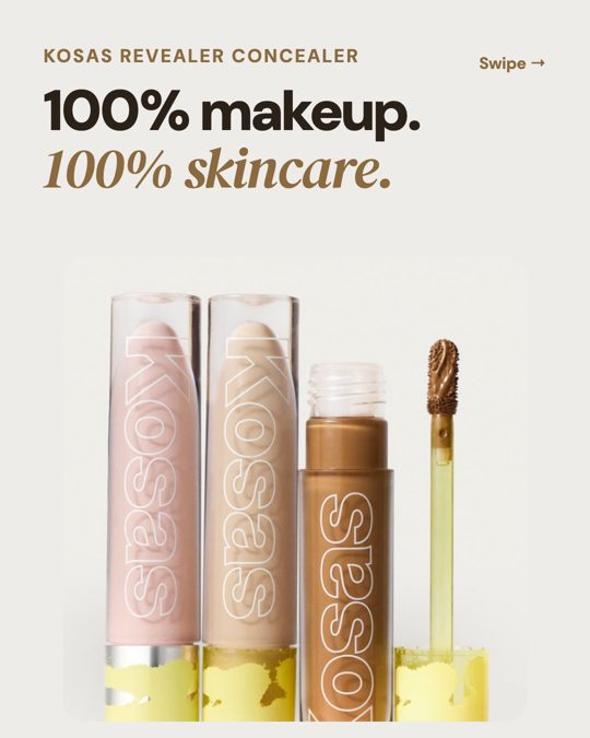
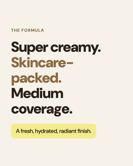
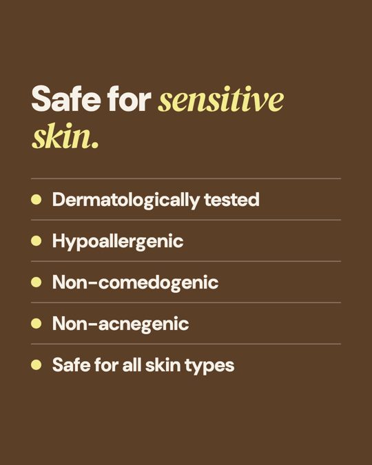
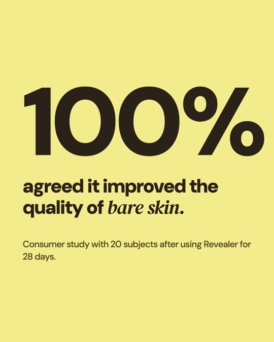
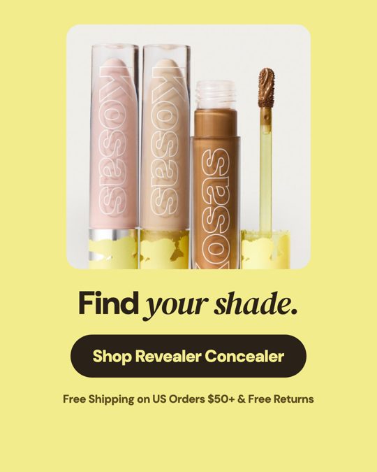
A super creamy, skincare-packed clean concealer with a fresh, hydrated, radiant finish. Safe for sensitive skin. Find your shade at kosas.com.
Revealer Concealer by Kosas · [Shop now]
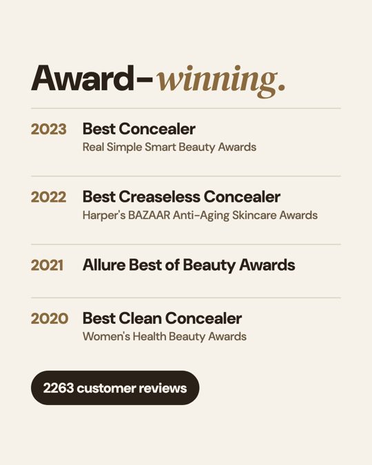
“A opens with a specific, differentiated benefit (concealer that improves bare skin) backed by a study, four awards, review counts and a clear offer, giving strangers real reasons to buy, while B's first slide is just the product name with a generic descriptor and thin proof.”
Make an Instagram carousel ad for Revealer Concealer, shown in the feed to people who don't know Kosas. Its one goal: get them to buy Revealer Concealer.
- 5 to 8 slides, swiped in order. Each slide is one complete, self-contained HTML file exactly 1080x1350 pixels (4:5): inline CSS, Google Fonts allowed, no scripts, no other outside files, nothing outside the 1080x1350 box. Each slide is screenshotted at exactly that size.
- People see the slides small, on a phone, so keep the words few and large.
- Around the carousel the ad shows your primary text, a headline under the cards and a button.
Images: you may use only these photos of the real product, by exact file name, or none:
- ref-1.jpg: Three Kosas concealer tubes beside a coated applicator.
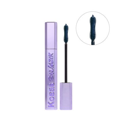
- ref-2.jpg: Kosas mascara tube, wand, and magnified brush inset.
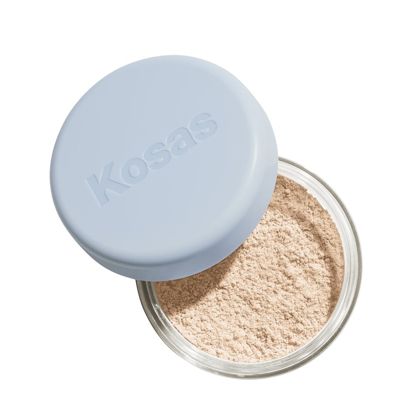
- ref-3.jpg: Open Kosas loose powder jar with blue lid.
Don't draw, mock up or describe product screens or photos that aren't in these files.

Everything known about Kosas (public facts, as of November 19, 2026):

--- brief.md ---
# Kosas (real brand; public facts as of 2026-11-19)

Website: kosas.com. Facts below come from the brand's own site, each with the exact words it says.

## What they sell

- Kosas sells Revealer Concealer, described as a super creamy skincare-packed clean concealer with medium coverage. ("A super creamy, skincare-packed clean concealer with medium coverage and a fresh, hydrated, radiant finish.")
- Kosas sells Revealer Skin-Improving Foundation SPF 25. ("Revealer Skin-Improving Foundation SPF 25")
- Kosas sells Plump + Juicy Cleansing Oil. ("Plump + Juicy Cleansing Oil")
- Kosas sells a lengthening and lifting peptide mascara. ("Lengthening + Lifting Peptide Mascara")
- Kosas sells a wet glisten powder highlighter for face and eyes. ("Wet Glisten Powder Highlighter for Face + Eyes")
- Kosas sells a hyaluronic acid contouring lip liner. ("Hyaluronic Acid Contouring Lip Liner")
- Kosas sells an AHA and enzyme exfoliating body wash. ("AHA + Enzyme Exfoliating Body Wash")

## Who it's for (their words)

- Kosas is positioned for a healthy, flattering look from formulas that blur makeup and skincare. ("Easy, weightless clean formulas that blur the lines between makeup and skincare for a healthy, flattering look.")
- Revealer Concealer is described as safe for all skin types. ("making it safe for all skin types.")
- The brand says it is for people who want healthy skin built, not covered. ("We believe healthy skin is built, not covered")
- Revealer was inspired by sensitive, acne-prone skin made worse by makeup. ("makeup making her sensitive, acne-prone skin worse.")
- Revealer Concealer is positioned as dermatologically tested and safe for sensitive skin. ("Dermatologically tested. Safe for sensitive skin. Hypoallergenic. Non-comedogenic. Non-acnegenic.")

## Proof they publish

- Revealer Concealer shows 2263 total customer reviews. ("2263  2263 total customer reviews")
- Revealer Concealer won Best Concealer at the Real Simple Smart Beauty Awards in 2023. ("Best Concealer, Real Simple Smart Beauty Awards (2023)")
- It was named Best Creaseless Concealer by Harper's BAZAAR in 2022. ("Best Creaseless Concealer, Harper's BAZAAR Anti-Aging Skincare Awards (2022)")
- It was included in the Allure Best of Beauty Awards in 2021. ("Allure Best of Beauty Awards (2021)")
- Women's Health named it Best Clean Concealer in 2020. ("Best Clean Concealer, Women's Health Beauty Awards (2020)")
- A consumer study of 20 subjects used Revealer for 28 days. ("In a consumer study with 20 subjects after using Revealer for 28 days:")
- In that study, 100% agreed it improved the quality of bare skin. ("100% agreed this product improved the quality of bare skin")

## Offers

- US orders of $50 or more include free shipping and free returns. ("Free Shipping on US Orders $50+ & Free Returns")

## Sources

- https://kosas.com/
- https://kosas.com/products/revealer-concealer

--- site.md ---
[432 words of Kosas’s homepage text, copied from kosas.com on November 19, 2026. Left out of this page because it’s the brand’s own copy.]

--- reviews.md ---
[8 real customer reviews, word for word and cut at 60 words, from Trustpilot. Left out of this page because they’re the customers’ words.]


Rules for this job:
- Anything said about Kosas or its products uses only the facts below: no invented numbers, prices, offers, features, customers, quotes, reviews, awards or dates, and facts kept exact.
- No one in the ad poses as a customer, gives a review or testimonial, or shows results they got; reviews may be quoted only word for word from the facts.
- Return only the fields asked for.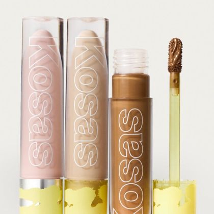
Two Instagram carousel ads for Revealer Concealer, shown in the feed to people who don't know Kosas. Each one's goal is to get them to buy Revealer Concealer. You see every slide in swipe order and the text shown around the ad. Which ad would get more people to buy Revealer Concealer? Answer A or B; say tie only if you truly can't separate them. One sentence on why.

[Then each ad: the text on every slide, the text around it, and every slide as an image.]
| Judge | Shown as A | Shown as B | Picked | Why, in the judge’s words |
|---|---|---|---|---|
| Claude Fable 5.2 | Gemini | Sol | Gemini | A opens with a specific, differentiated benefit (concealer that improves bare skin) backed by a study, four awards, review counts and a clear offer, giving strangers real reasons to buy, while B's first slide is just the product name with a generic descriptor and thin proof. |
| Claude Fable 5.2 | Sol | Gemini | Gemini | B opens with a distinctive benefit hook (concealer that improves bare skin) backed by concrete proof for a cold audience — a consumer study, four named awards, review count, sensitive-skin credentials — and closes with a richer offer, whereas A's opening slide is just the product name with generic claims and thinner proof. |
| GPT-6.2 Astra | Gemini | Opus | Gemini | A gives first-time shoppers a reason to try Revealer before they swipe—the first slide pairs a specific bare-skin benefit with a consumer study, and the headline offers 25% off. |
| GPT-6.2 Astra | Opus | Gemini | Gemini | Before viewers even swipe, B explains what the concealer could do for their bare skin, backs that claim with a consumer study, and gives first-time buyers a reason to act with 25% off in the headline. |
| Gemini 4 Carbon | Sol | Opus | Sol | Ad A pairs a concise, visually engaging layout with a prominent 25% off Black Friday discount in the headline, primary text, and final slide, giving cold audiences a strong immediate incentive to buy compared to Ad B's text-heavy slides and lack of a promotional offer. |
| Gemini 4 Carbon | Opus | Sol | Sol | Ad B pairs a more concise, visually engaging five-slide overview of the concealer's core benefits and award credibility with a prominent 25% off Black Friday discount in the headline and copy, giving cold audiences a strong, urgent incentive to try an unfamiliar brand. |
An ad is copy and creative. So each video ad was judged again on its words alone, on its footage alone, as a viewer sees it in the feed, and by a judge that watches the video. Every angle: every pair, both orders, the judge from the third lab.
| Angle | Opus | Sol | Gemini |
|---|---|---|---|
| First run: 9 frames, all the text | 47% | 28% | 75% |
| As seen in the feed: 17 frames, text cut at “more” | 41% | 22% | 88% |
| Copy only: every word, no pictures | 31% | 50% | 69% |
| Creative only: the raw footage, no words | 69% | 12% | 69% |
| Watching the video with sound (Opus vs Sol only) | 69% | 31% | – |
The copy angle and the creative angle picked the same winner on only 48% of matchups: an ad’s words and its pictures are separate skills.
Judging from still frames and judging the actual video with sound agreed on 94% of the Opus-vs-Sol matchups, so the stills miss little.
The judges favoured the ad with more words: the longer one won 67% of first run votes, 75% of feed votes, 69% of copy votes. With length held equal (LMArena-style), copy only reads Sol 1211, Opus 1092, Gemini 697: Gemini’s copy wins on volume, not on craft. It was the longest in almost every matchup, so treat this as a strong pointer, not a verdict.
An ad is copy and creative. So each carousel ad was judged again on its words alone and as a viewer sees it in the feed. Every angle: every pair, both orders, the judge from the third lab.
| Angle | Opus | Sol | Gemini |
|---|---|---|---|
| First run: 9 frames, all the text | 38% | 56% | 56% |
| As seen in the feed: 17 frames, text cut at “more” | 38% | 53% | 59% |
| Copy only: every word, no pictures | 38% | 53% | 59% |
Yes-or-no checks taken from the Boring Marketing skills (the copy scorecard, the email checklist, the positioning method, the motion-ads rules and the carousel template). Each check is answered by the two judges from other labs; the score is the average of their answers. (An earlier version needed both to say yes, which let one strict judge zero out the two models it checks.) These explain the ranking; they don’t make it. Overall pass rate: Opus 62%, Sol 64%, Gemini 56%.
| Check | Opus | Sol | Gemini |
|---|---|---|---|
| Clear from the first screen | 81% | 88% | 69% |
| One goal, nothing competing | 94% | 100% | 19% |
| Sells the outcome | 69% | 50% | 44% |
| Specific claims | 38% | 62% | 69% |
| Proof near the ask | 94% | 94% | 94% |
| Answers the main doubt | 44% | 19% | 31% |
| Real urgency, or none | 100% | 94% | 100% |
| Sounds human | 0% | 56% | 0% |
| Flows to the button | 25% | 62% | 12% |
| Works on a phone | 94% | 100% | 88% |
| Check | Opus | Sol | Gemini |
|---|---|---|---|
| One purpose per email | 31% | 75% | 19% |
| Value before the ask | 44% | 50% | 44% |
| Preview adds to the subject | 81% | 100% | 81% |
| Clean subject lines | 56% | 81% | 31% |
| Handles the main doubt | 44% | 38% | 38% |
| Sensible timing | 69% | 100% | 88% |
| Specific to the product | 88% | 100% | 94% |
Every judge said no for every model on: a reason to open the next, sounds human. Those checks don’t separate the models.
| Check | Opus | Sol | Gemini |
|---|---|---|---|
| Sells the outcome | 69% | 75% | 69% |
| Names the alternative | 100% | 69% | 94% |
| Unique mechanism | 25% | 25% | 25% |
| Commits to one thing | 88% | 88% | 69% |
| Reads the market's fatigue | 12% | 12% | 0% |
| Backed by proof | 75% | 75% | 75% |
| Usable tomorrow | 100% | 94% | 100% |
| Says what not to say | 100% | 62% | 100% |
| Check | Opus | Sol | Gemini |
|---|---|---|---|
| One audience first | 100% | 100% | 75% |
| A real lever from the facts | 100% | 100% | 100% |
| Budget adds up | 100% | 93% | 100% |
| 3 distinct concepts | 100% | 100% | 100% |
| Ads match the page | 100% | 100% | 100% |
| Stop, fix and scale numbers | 100% | 93% | 100% |
| A test plan | 44% | 14% | 6% |
| Plausible costs | 56% | 71% | 44% |
| Check | Opus | Sol | Gemini |
|---|---|---|---|
| Hook on the first frame | 56% | 62% | 69% |
| Product in the first 2 seconds | 75% | 69% | 56% |
| Works muted | 100% | 100% | 100% |
| One message | 50% | 62% | 25% |
| Product looks real | 19% | 6% | 6% |
| No AI glitches | 31% | 0% | 6% |
| Ends on the next step | 56% | 88% | 81% |
| Feels native to Reels | 12% | 6% | 19% |
| No fake customers | 100% | 100% | 100% |
| Ad text lands | 50% | 44% | 44% |
| Check | Opus | Sol | Gemini |
|---|---|---|---|
| Slide 1 hooks | 25% | 6% | 69% |
| One point per slide | 6% | 69% | 0% |
| Readable on a phone | 12% | 88% | 0% |
| Real product, nothing mocked up | 100% | 75% | 94% |
| Carries proof | 100% | 62% | 100% |
| One ask at the end | 69% | 100% | 19% |
| Looks like one set | 100% | 100% | 100% |
| Ad text lands | 62% | 12% | 50% |
Every judge said no for every model on: pulls to the next slide, sounds human. Those checks don’t separate the models.
| Check | Opus | Sol | Gemini |
|---|---|---|---|
| Every claim about the brand backed by its facts | 79% | 100% | 90% |
| Page fits a phone screen | 88% | 100% | 88% |
| Button on the first phone screen | 100% | 100% | 100% |
| Email subject lines under 50 characters | 96% | 96% | 83% |
| Briefs and plans within the length asked | 56% | 100% | 94% |
| Ad headlines within 40 characters, so they aren’t cut off | 100% | 100% | 100% |
| Carousels with nothing cut off | 88% | 100% | 100% |
| Carousel slides with no text under about 11px on a phone | 96% | 0% | 0% |
| Video ads where the product looks like the real one | 19% | 6% | 6% |
The honesty gate counts any claim the brand’s facts don’t back, even a true one. Most of Opus’s failures were things that are true but weren’t in the brief (that Solo Stove’s fire pit burns wood, that ElevenLabs’ free plan includes the API); a few were real errors, like calling agent building free when it comes with a grant. Gemini added “verified” to a review count and promised not to email daily. No video or carousel ad failed it. Client work shouldn’t rest on the writer’s memory, so the gate stays strict.
Copywriting · words only, judged from three angles
For the same 8 brands, each model wrote a long sales page (words only, no design), 10 landing-page headlines, a Google search ad, a cold email or a product description, and a rewrite of one of the brand’s own real posts that flopped. Every pair was judged three times: by a judge reading as the customer, as a senior copywriter, and as the brand’s head of marketing with its homepage copy in view.
| Angle | Opus | Sol | Gemini |
|---|---|---|---|
| As the customer | 57% | 48% | 44% |
| As a senior copywriter | 51% | 57% | 42% |
| As the brand’s head of marketing | 45% | 67% | 38% |
| All three angles | 51% | 57% | 42% |
720 votes. Read the angles separately: the brand angle also sees the brand’s facts and homepage copy, so it asks a different question, and the “all three” row is a plain average, not a verdict. How often two angles picked the same winner: customer and copywriter 80%, customer and brand 50%, copywriter and brand 53%. Across all copy, with a 95% range from resampling brands: Sol 57% (47% to 69%), Opus 51% (48% to 54%), Gemini 41% (29% to 53%). The shorter piece won 50% of decided votes.
8 brands · 144 votes
50%: even
8 brands · 144 votes
50%: even
8 brands · 144 votes
50%: even
4 brands · 72 votes
50%: even
4 brands · 72 votes
50%: even
8 brands · 144 votes
50%: even
Rewriting a real flop · Zapier · X
AI only helps with work it can see When rules live in a stale doc and customer history lives in someone's head, it has to guess (and might guess wrong) Three builds that turn scattered knowledge into shared context for the whole team👇
Your AI isn't guessing because it's dumb. It's guessing because the real rules are in a doc nobody's touched in months, and the customer history is in your best rep's head. It can only help with work it can see. 3 builds that turn scattered know-how into shared context your whole team (and your AI) can use 👇
AI can’t read your teammate’s mind. If the playbook is stale and customer history lives in their head, AI has to guess. Sometimes it guesses wrong. Give AI and the whole team the same context: capture updates with Forms, store them in Tables, and use them in Zaps.
Stop blaming AI for an access problem. AI can only help with work it can reach. Keep rules in a stale doc and customer history in someone's head, and it's forced to guess—and can get things wrong. 3 builds that turn scattered know-how into context your whole team can use:
This is a real post on X that Zapier published on X. It underperformed: it got under a third of a similar post's engagement.

What it's about:
- Automated tools can only assist with work they can access
- Outdated written rules plus client history held only in memory force the system to infer, and it can be wrong
- Three products convert dispersed know-how into information the full team can use together

The post on X as published:
"AI only helps with work it can see

When rules live in a stale doc and customer history lives in someone's head, it has to guess (and might guess wrong)

Three builds that turn scattered knowledge into shared context for the whole team👇"

Rewrite it so it does better with the same audience, about the same subject, on the same channel. Then say in one sentence what you changed and why.

Everything known about Zapier (public facts, as of November 19, 2026):

--- brief.md ---
# Zapier (real brand; public facts as of 2026-11-19)

Website: zapier.com. Facts below come from the brand's own site, each with the exact words it says.

## What they sell

- Zapier sells no-code automation across 9,000+ apps. ("No-code automation across 9,000+ apps")
- The Free plan is $0 per month and includes Zaps, Tables, and Forms with 100 tasks per month. ("Start automating with AI. Zaps, Tables, and Forms included (100 tasks per month).")
- Professional starts at $19.99 per month and unlocks unlimited access to Zaps, Tables, and Forms. ("Unlock the full power of the Zapier platform with unlimited access to Zaps, Tables, and Forms.")
- The Team plan starts at $69 per month for collaborating on AI-powered systems. ("Collaborate with your team to build and manage complete AI-powered systems.")
- Enterprise pricing is contact-only and is positioned to scale systems across the organization. ("Scale AI-powered systems across your entire organization.")
- Every plan includes the full platform, including Zap workflows, Forms, and Tables. ("All plans include access to the full Zapier platform, including Zap workflows, Forms, and Tables.")

## Who it's for (their words)

- Zapier says it is built for everyone from the Fortune 500 to first-time founders. ("Built for everyone, from the Fortune 500 to first-time founders")
- Teams use it in boardrooms, spare rooms, and anywhere AI has ROI. ("Teams use Zapier in boardrooms, spare rooms, and anywhere that AI has ROI.")
- It is offered for startups, small and medium businesses, and enterprise. ("How Zapier can help you automate your work across teams")
- Marketing teams are a stated audience for campaign effectiveness and ROI. ("Multiply campaign effectiveness and ROI")
- IT teams are a stated audience for managing systems with automation. ("Better manage systems with automation")
- HR teams are a stated audience for AI automation. ("Empower your HR team with AI automation")

## Proof they publish

- Zapier says it is trusted by the world's best companies. ("Trusted by the world's best companies")
- Mercari US is a named customer, cited via Eric McNulty. ("Eric McNulty, Systems Manager for Customer Experience at Mercari US")
- A Mercari story reports 47,000 tickets resolved entirely by Zapier each month. ("47,000 tickets resolved entirely by Zapier each month")
- Okta is a named customer, cited via Korey Marciniak. ("Korey Marciniak, Customer Support Strategy and Operations at Okta")
- The Okta story says 13% of Workforce Identity escalations are handled automatically. ("13% of Okta Workforce Identity escalations handled automatically")
- Palo Alto Networks is a named customer, cited via Stas Bilder. ("Stas Bilder, Solutions Architect, Prisma Browser at Palo Alto Networks")

## Offers

- There is a free tier that includes 100 tasks per month. ("Start automating with AI. Zaps, Tables, and Forms included (100 tasks per month).")
- Zapier describes its pricing as flexible and risk-free. ("Our commitment to flexible, risk-free pricing")

## Sources

- https://zapier.com/
- https://zapier.com/pricing

--- site.md ---
[255 words of Zapier’s homepage text, copied from zapier.com on November 19, 2026. Left out of this page because it’s the brand’s own copy.]

--- reviews.md ---
[8 real customer reviews, word for word and cut at 60 words, from Trustpilot. Left out of this page because they’re the customers’ words.]


Rules for this job:
- Anything said about Zapier or its products uses only the facts below and the subject above: no invented numbers, prices, offers, features, customers, quotes, reviews, awards or dates, and facts kept exact.
- Return only the fields asked for.None. The brand had no product photos to give, so the model was told not to show the product in detail.
Claude Opus 5.5: what it changed and why
I swapped the abstract opener for a pushback on a common belief and made the stale doc and memory-only history concrete, so readers recognize their own team before the payoff, without adding any new claims about Zapier.
GPT-6.2 Sol: what it changed and why
I led with a relatable hook and gave Forms, Tables, and Zaps a clear role so readers can see both why AI guesses and what their team can do about it.
Gemini 4 Neon: what it changed and why
I replaced the flat opening and generic thread-bait emoji with a provocative hook that reframes AI failures as an access problem, cut the weak parenthetical to sharpen the stakes, and tightened the copy under 280 characters to earn more stops and clicks on X.
[customer] Picture yourself as someone who follows Zapier on X. Below are two versions of the same post. Go with your gut as that person: which one makes you more likely to stop and engage with it?

[copywriter] You're a senior direct-response copywriter reviewing two drafts of a post on X rewritten from one that underperformed. Which is the stronger copywriting for the job? Weigh clarity, specificity, proof, desire, flow and voice; don't reward length for its own sake.

[brand] You're Zapier's head of marketing. Your facts and your homepage copy are below. Which of these two drafts of a post on X rewritten from one that underperformed would you rather publish under Zapier's name? Weigh whether it sounds like Zapier, stays true to the facts, and carries no risk to the brand.
| Judge | Shown as A | Shown as B | Picked | Why, in the judge’s words |
|---|---|---|---|---|
| Claude Fable 5.2 | Gemini | Sol | Sol | [brand] B opens with a friendly, human hook and ties the problem to Forms, Tables, and Zaps exactly as the site describes them, while A's scolding "Stop blaming AI" opener sounds less like Zapier and promises three builds it never shows. |
| Claude Fable 5.2 | Sol | Gemini | Sol | [brand] A is a complete, friendly, practical post that ties the problem to real Zapier products (Forms, Tables, Zaps) exactly as the site describes them, while B opens with a scolding tone and ends on a dangling "3 builds" teaser that promises content it doesn't deliver. |
| GPT-6.2 Astra | Gemini | Opus | Gemini | [brand] A makes the access problem concrete and points readers toward a practical fix without calling AI “dumb” or implying that missing context is the only reason it guesses. |
| GPT-6.2 Astra | Opus | Gemini | Gemini | [brand] B fits a standard X post, makes the missing-context problem concrete, and avoids the word “dumb” without promising that better access will make AI error-free. |
| Gemini 4 Carbon | Sol | Opus | Sol | [brand] Draft A stands on its own as a complete, helpful post that accurately connects the problem directly to Zapier's core platform pillars (Forms, Tables, and Zaps) in a clear, brand-safe voice, whereas Draft B uses rougher phrasing ('dumb') and dangles an unfulfilled thread hook ('3 builds... 👇') with no actual Zapier product tie-in. |
| Gemini 4 Carbon | Opus | Sol | Sol | [brand] Draft B works as a standalone post without promising an unwritten thread and directly connects the problem to Zapier's core platform capabilities—Forms, Tables, and Zaps—accurately reflecting how our products work together. |
| Claude Fable 5.2 | Gemini | Sol | Sol | [copywriter] B opens with a sharper, more concrete hook, flows in short punchy lines, and pays off with a specific mechanism (Forms, Tables, Zaps), while A is denser, more scolding, and ends on a vague teaser. |
| Claude Fable 5.2 | Sol | Gemini | Sol | [copywriter] A opens with a sharper, more concrete hook, flows cleanly in short lines, and pays off with a specific solution (Forms, Tables, Zaps), while B is a dense block with a scolding opener that ends on an unfulfilled teaser. |
| GPT-6.2 Astra | Gemini | Opus | Opus | [copywriter] The opening makes you want to know why the AI is guessing, the best rep’s head is a more vivid detail than “someone’s head,” and the payoff makes clear who benefits: both the team and its AI. |
| GPT-6.2 Astra | Opus | Gemini | Opus | [copywriter] The rules nobody’s touched and the customer history in your best rep’s head make the problem tangible, and A moves from hook to payoff without B’s redundant “and can get things wrong.” |
| Gemini 4 Carbon | Sol | Opus | Opus | [copywriter] B pairs a sharper reframing hook and vivid, relatable specifics with an actionable, curiosity-driving close, whereas A stalls out on a flat, premature product-feature dump. |
| Gemini 4 Carbon | Opus | Sol | Opus | [copywriter] Draft A pairs a sharper, contrarian hook with vivid workplace specifics to build strong curiosity for the thread, whereas Draft B kills momentum by flattening the pain point and rushing straight into a premature product pitch. |
| Claude Fable 5.2 | Gemini | Sol | Sol | [customer] B opens with a punchy, relatable hook, is easy to scan with line breaks, and gives a concrete takeaway, whereas A is a dense block that feels preachy and ends on a teaser. |
| Claude Fable 5.2 | Sol | Gemini | Sol | [customer] A opens with a short, relatable hook and reads cleanly with a concrete payoff, while B feels like a dense block that scolds and then trails off into a teaser. |
| GPT-6.2 Astra | Gemini | Opus | Opus | [customer] The opening makes me want to read the next line, and I recognize the problem of customer history living in one rep’s head, so I’d click to see the three builds. |
| GPT-6.2 Astra | Opus | Gemini | Opus | [customer] The opening makes me pause, and the detail about customer history living in my best rep’s head makes me want to see the three builds. |
| Gemini 4 Carbon | Sol | Opus | Opus | [customer] B hooks me immediately with a sharp, relatable workplace reality and promises actionable tutorials in a thread rather than just pitching product features like A does. |
| Gemini 4 Carbon | Opus | Sol | Opus | [customer] A hooks me with a relatable operational pain point and promises actionable builds in a thread, whereas B reads too much like a standard product pitch. |
Checks from the Boring Marketing skills (the copy scorecard, the search-ad rules), each scored as the average of the two judges from other labs.
| Check | Opus | Sol | Gemini |
|---|---|---|---|
| Clear in one pass | 100% | 94% | 100% |
| Specific | 56% | 62% | 69% |
| One human voice | 0% | 25% | 0% |
| A picture of the after | 44% | 62% | 31% |
| Proof for every claim | 19% | 75% | 19% |
| Honest urgency, or none | 94% | 100% | 94% |
| Flows to the button | 0% | 50% | 0% |
| Answers the main doubt | 25% | 38% | 44% |
| One ask | 69% | 100% | 75% |
| Survives an AI summary | 94% | 81% | 81% |
| Check | Opus | Sol | Gemini |
|---|---|---|---|
| 10 different angles | 31% | 62% | 31% |
| Specific | 94% | 81% | 100% |
| Clear on its own | 0% | 19% | 19% |
| Leads with the outcome | 12% | 62% | 44% |
| No hype | 25% | 94% | 19% |
| Best one first | 31% | 44% | 31% |
| Check | Opus | Sol | Gemini |
|---|---|---|---|
| Echoes the search | 38% | 62% | 75% |
| Any 3 read well together | 6% | 44% | 50% |
| Each works alone | 6% | 81% | 50% |
| No repeats | 0% | 19% | 6% |
| Claims, not labels | 0% | 6% | 0% |
| Clear next step | 100% | 100% | 100% |
| Check | Opus | Sol | Gemini |
|---|---|---|---|
| About the reader | 75% | 100% | 100% |
| One small ask | 25% | 100% | 62% |
| Specific | 100% | 100% | 100% |
| Plain subject line | 62% | 88% | 38% |
| No fake familiarity | 88% | 100% | 100% |
| One person to one person | 0% | 25% | 0% |
| Check | Opus | Sol | Gemini |
|---|---|---|---|
| Clear from line one | 25% | 25% | 38% |
| Sells the outcome | 75% | 100% | 50% |
| Specific | 100% | 100% | 88% |
| Scannable | 88% | 88% | 75% |
| Carries proof | 100% | 75% | 100% |
| Answers the doubt | 75% | 75% | 62% |
| Sounds human | 0% | 25% | 0% |
| Check | Opus | Sol | Gemini |
|---|---|---|---|
| Same subject, same facts | 62% | 94% | 75% |
| Fixes a real weakness | 100% | 100% | 100% |
| Stronger opening | 94% | 88% | 88% |
| Fits the platform | 81% | 100% | 81% |
| Specific | 94% | 88% | 94% |
| Sounds human | 19% | 19% | 12% |
| Check | Opus | Sol | Gemini |
|---|---|---|---|
| Every claim backed by the brand’s facts | 90% | 100% | 98% |
| Rewrite beat the brand’s real flop (share of votes) | 78% | 69% | 56% |
Search-ad headlines over Google’s 30-character limit: Opus 0.0 per ad, Sol 0.0 per ad, Gemini 0.0 per ad. Average reading grade: Opus 6.0, Sol 5.9, Gemini 7.9.
Search and keyword research · real data
For the same 8 brands, every model got the same real search data: keyword ideas with monthly searches and difficulty, the keywords the brand already ranks for, and today’s top Google results for one category search (DataForSEO and SerpAPI, November 2026). Each made a 90-day keyword plan and wrote the page to rank for that search. The page was also judged against the page that ranks #1 today.
| Angle | Opus | Sol | Gemini |
|---|---|---|---|
| Keyword plan, as a senior SEO strategist | 16% | 62% | 72% |
| Keyword plan, as the brand’s head of marketing | 31% | 62% | 56% |
| The page, as the searcher | 61% | 50% | 38% |
| The page, as a senior SEO strategist | 39% | 54% | 58% |
| The page against today’s #1 result, as the searcher | 69% | 78% | 75% |
Beating today’s #1 here means the judges preferred the page’s words; real rankings also depend on links, authority and the site, which a judge can’t see, and some #1 results are thin pages (an app screen, a store listing). 176 votes between models. Keywords per plan that aren’t in the data: Opus 0.1, Sol 0.0, Gemini 0.0. Keywords the brand already ranks top 3 for: Opus 0.0, Sol 0.0, Gemini 0.0. Monthly searches covered by the plan: Opus 83,388, Sol 96,804, Gemini 87,248.
| Check | Opus | Sol | Gemini |
|---|---|---|---|
| Search volumes quoted exactly as the data gives them | 100% | 100% | 100% |
| Difficulty quoted exactly | 100% | 100% | 100% |
| Title tag within 60 characters | 100% | 100% | 100% |
| Meta description within 155 characters | 100% | 100% | 100% |
| The search’s words in the title tag | 100% | 100% | 100% |
Video editing · the same footage, edited in code
Like Motion’s test (same clip, same prompt, same harness), but for ads. Every model got the same three generated clips per brand and the brand’s real photos, and edited a 15-second Reels ad in code with HyperFrames, the route in the skills’ motion-ads mode. Lint errors went back to the model, up to twice, the same for everyone; then it rendered on our machine.
| Angle | Opus | Sol | Gemini |
|---|---|---|---|
| As seen in the feed: 17 frames and what’s said | 77% | 23% | 50% |
| Watching with sound (Opus vs Sol only) | 64% | 36% | – |
Edits that rendered: Opus 8 of 8, Sol 8 of 8, Gemini 5 of 8. Repair rounds needed, on average: Opus 1.1, Sol 1.9, Gemini 2.1.
Video edit · Ridge
A typical brand: of the 8, the one whose result is closest to the result across all of them.
| Check | Opus | Sol | Gemini |
|---|---|---|---|
| Hook on frame 0 | 100% | 86% | 88% |
| Works muted | 100% | 100% | 100% |
| Product in 2 seconds | 50% | 57% | 50% |
| A proof moment | 93% | 79% | 88% |
| Clear offer or next step | 100% | 100% | 100% |
| End card | 100% | 100% | 100% |
| Words in the safe area | 64% | 79% | 50% |
| A real edit, not a slideshow | 86% | 0% | 100% |
| Cuts around glitchy footage | 57% | 79% | 62% |
| Native to Reels | 7% | 0% | 0% |
How each model writes · 704 pieces
Every piece made in this eval, and the brands’ own real pieces, measured in code and labelled by two models from labs that aren’t competing (Qwen 4 Max and DeepSeek V4 Pro). A label counts only when both agree. They agreed on the opening hook 73%, the shape of the piece 59%, register 68%, the call to action 87%; the shape labels are the noisiest.
| Per piece, on average | Opus | Sol | Gemini | Brands |
|---|---|---|---|---|
| Reading grade (US school year) | 6.2 | 6.1 | 8.2 | 6.7 |
| Words per sentence | 9.0 | 9.2 | 12.6 | 9.1 |
| “You” per 100 words | 2.9 | 2.6 | 2.4 | 3.1 |
| “We” per 100 words | 0.8 | 0.4 | 0.5 | 1.0 |
| Numbers per 100 words | 5.4 | 4.2 | 5.6 | 2.2 |
| Questions per piece | 0.71 | 0.59 | 0.65 | 0.13 |
| Exclamation marks per piece | 0.05 | 0.02 | 0.05 | 0.05 |
| Em dashes per 100 words | 0.01 | 0.12 | 0.69 | 0.22 |
| AI tells per 100 words | 0.06 | 0.02 | 0.12 | 0.15 |
| Most-used hooks | The product’s name 36% A question 14% The outcome 13% | The product’s name 41% A question 18% A command 11% | The product’s name 40% A command 9% The outcome 8% | The product’s name 26% A curiosity gap 13% News 12% |
| Most-used shapes | Announcement 23% How-to or list 18% Classic persuasive arc 13% | How-to or list 24% Announcement 16% Feature list 14% | How-to or list 22% Announcement 20% Classic persuasive arc 16% | Announcement 34% How-to or list 21% Story 14% |
Across 1,668 model-against-model votes, counting only matchups where one piece used the hook or shape and the other didn’t. 50% means it makes no difference.
In the same votes: the harder-to-read piece won 42%; the longer piece won 48%; the piece with more “you” won 51%; the piece with more numbers won 45%; the piece with more questions won 53%; the piece with more em dashes won 44%; the piece with more AI tells won 49%.
The brands’ own pieces come with real outcomes: 55 proven winners and 55 flops. Too few to prove anything, but they’re real. Winners averaged reading grade 6.73 and 24 words; flops averaged grade 6.72 and 34 words.
| Opening hook | Real winners | Real flops |
|---|---|---|
| The product’s name | 11 | 10 |
| A curiosity gap | 6 | 5 |
| News | 6 | 4 |
| A number | 4 | 5 |
| A command | 4 | 5 |
| A question | 4 | 2 |
| The outcome | 4 | 2 |
| A pain or problem | 0 | 5 |
| A story or scene | 2 | 2 |
A second panel of judges
The council judges each pair with the one lab that isn’t in it, so a judge’s taste can look like a model’s strength. So judges from labs outside the race, the ones that passed the same tryout, judged every pair again with exactly the same inputs, in both orders.
| Angle | Opus | Sol | Gemini |
|---|---|---|---|
| Deep work | 57% | 58% | 35% |
| Copywriting (as a copywriter) | 66% | 42% | 42% |
| Search (as an SEO strategist) | 45% | 43% | 62% |
| Video editing | 73% | 21% | 57% |
How often the outside panel’s majority picked the same winner as the council, on the same pair and order: copywriting 87% of 187, deep work 89% of 249, video editing 90% of 31, search 77% of 66. Each outside judge’s share of wins by model: Kimi K3.1 Pro: Opus 62%, Sol 47%, Gemini 41%; Qwen 4 Max: Opus 57%, Sol 49%, Gemini 44%.
Live test · real visitors, real sign-ups
Judges aren’t customers, so we put the models’ work in front of real people. Each model rewrote the sign-up screen of our own free playbook page, from the same facts. Every visitor sees one of four screens at random, the current page or one model’s, and the only thing that differs is the marketing.
Ready to start. Results appear here as visitors arrive, and count only when the rule below ends the test.
The rule, fixed before the first visitor: run until every screen has 400 visitors or for 28 days; pause any screen that falls clearly behind (one-sided p < 0.01 after 150 visitors); a model’s screen beats the current page only if p < 0.05 after correcting for three comparisons.
Against the brand’s own work
Every job also included the brand’s real piece: half proven winners (they kept running for months, or got at least 3 times the views or engagement of a similar piece), half flops. Across channels the judges picked the AI version 19% of the time against winners and 32% against flops. On YouTube it was 46% and 73%.
These comparisons aren’t blind. Asked which piece was AI-made, the judges were right 98% of the time, so “the brand wins” may partly be judges preferring what they can tell is real. That’s why the leaderboard uses model-against-model votes only.
Can people tell? Play “Which one is real?” in the quiz. The crowd’s answer goes here once enough people have played.
Examples
Four pieces where the judges preferred an AI version over the brand’s own, and one where the brand won every vote. Open the panels under each one for the exact prompt and photos every model got, the prompt each model then wrote for the image model, and every judge’s vote with its reason. A judge preferring a piece isn’t proof it would do better with real customers; a live test is.
YouTube · Miro
Miro x Endava: Powering Dava.Flow™ AI-Native Delivery
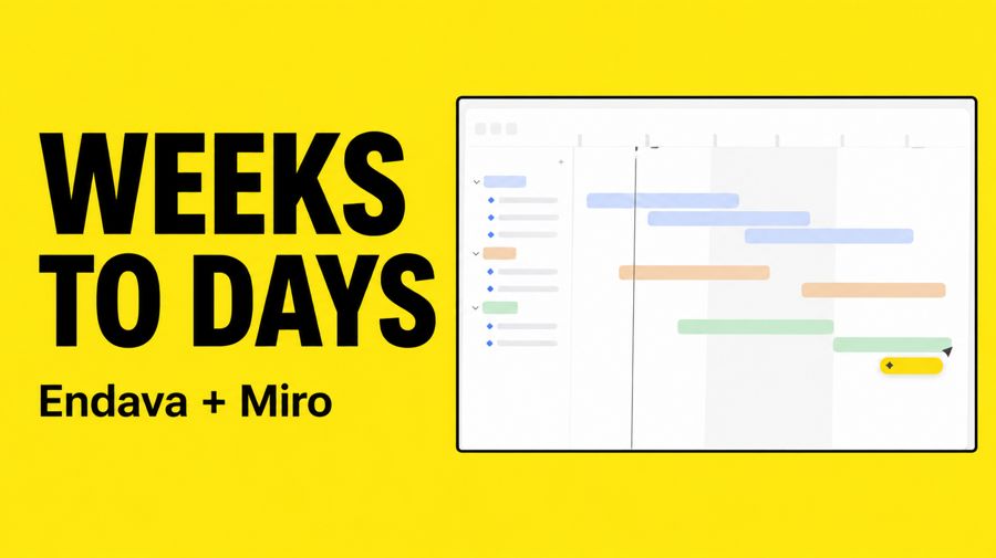
How Endava Scales AI Workflows Across Teams With Miro
“[Sol's version] leads with a concrete outcome (“Weeks to Days”) in a bold, high-contrast thumbnail and a clear how-to title, while [Miro's] is a jargon-heavy partner announcement with a dim, logo-over-photo image that gives viewers little reason to click.”
This is Miro's next YouTube video. Write its title and design its thumbnail.

What the video covers:
Length: 00:02:05
Description:
By deploying Miro enterprise-wide, Endava is strengthening how its teams run workshops, align stakeholders, and hand over work across programmes. Early adoption is already showing measurable improvements in workshop outcomes, stakeholder alignment, and handover quality — with some processes reduced from weeks to days through automated, multi-step AI flows.
For Endava's clients, this means:
• Shorter decision cycles
• Reduced waste and rework
• Faster movement from insight to impact
Together, Miro and Endava are helping organizations move beyond experimentation and into scalable, enterprise-wide AI transformation.

Everything known about Miro (public facts, as of November 19, 2026):

--- brief.md ---
# Miro (real brand; public facts as of 2026-11-19)

Website: miro.com. Facts below come from the brand's own site, each with the exact words it says.

## What they sell

- The Starter plan costs $8 per member per month when billed yearly. ("$8/month per member, billed yearly")
- The Business plan costs $20 per member per month when billed yearly. ("$20/month per member, billed yearly")
- Starter is for small teams that collaborate regularly and want unlimited boards. ("For small teams collaborating regularly with unlimited boards")
- Business is for growing organizations and consultants streamlining workflows with AI. ("For growing organizations and consultants to streamline workflows with AI")
- Business includes more than 4,700 shapes for technical and process mapping. ("4,700+ shapes to map technical systems, cloud infrastructure, and business processes with Mermaid, UML, AWS, BPMN, and more")
- Enterprise includes regional data hosting in the EU, US, Australia, and Japan. ("Data residency options in EU, US, Australia, and Japan")
- Enterprise can add premium 24/7 support with guaranteed SLAs. ("Access premium 24/7 support and guaranteed SLAs")

## Who it's for (their words)

- Miro calls itself the AI platform for teamwork. ("The AI platform for teamwork")
- It is meant for team and cross-team collaboration with AI, not only individual productivity. ("Move beyond individual AI productivity to team and cross-team collaboration with AI.")
- The Intelligent Canvas is where a team and agents think, plan, and build together. ("The Intelligent Canvas where your team and agents think, plan, and build together")
- The Free plan is for small teams getting started with Miro. ("For small teams getting started with Miro")
- Enterprise is for large organizations that need security, governance, and AI at scale. ("For large organizations that need security, governance, and AI at scale")
- Business is described as best for teams and consultants. ("Best for teams and consultants")

## Proof they publish

- More than 250,000 companies use Miro. ("See how over 250,000 companies are getting great done in Miro")
- Miro cites 100 million-plus people collaborating on the product. ("100M+ people collaborating on Miro")
- Miro has more than 20,000 reviews on Capterra, G2, and TrustRadius. ("20,000+ reviews from Capterra, G2 and Trustradius")
- Miro cites 3.6x faster time to market. ("3.6x faster time to market")
- Miro cites a 50% shorter planning process. ("50% shorter planning process")
- The Free plan highlights more than 7,000 Miro and community templates. ("Start faster with 7000+ Miro and community-made templates")

## Offers

- On the Free plan, unlimited boards can be created and shared, but only the three most recent stay editable. ("Create and share unlimited boards. Three most recent ones will remain editable")
- Yearly billing is presented as a standing 20% saving versus monthly. ("MonthlyYearly (save 20%)")

## Sources

- https://miro.com/
- https://miro.com/pricing/

--- site.md ---
[457 words of Miro’s homepage text, copied from miro.com on November 19, 2026. Left out of this page because it’s the brand’s own copy.]

--- reviews.md ---
[8 real customer reviews, word for word and cut at 60 words, from Trustpilot. Left out of this page because they’re the customers’ words.]


Rules for this job:
- Customer-facing words use only the facts above (the subject and the brand's facts): nothing invented, facts kept exact.
- The image is made by an image model from your prompt. Describe exactly what's in it. Put any words that appear in the image in quotes, and keep them few.
- No real person's face or likeness, and no celebrities. If the piece needs a person, describe a generic one (an unnamed founder, a customer), never a named, real person. The brand's name may appear as text; no other logos.
- The image model also gets the 2 reference photo(s) of Miro's real product shown below. When the product appears, refer to them by number in your image prompt ("the wallet from Reference 1") so it's shown exactly as it is. Don't invent product details.
- Return only the fields asked for.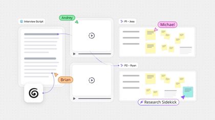
GPT-6.2 Sol’s prompt to the image model
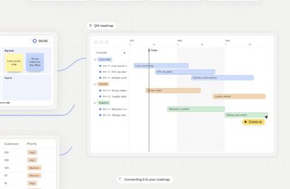
Create a 16:9 YouTube thumbnail at 1280 × 720 with a bold yellow background and a clean two-column layout. On the left, set “WEEKS TO DAYS” in oversized, heavy black sans-serif type, stacked as “WEEKS” above “TO DAYS”. Place the smaller plain-text byline “Endava + Miro” directly below. On the right, show a large, straight-on crop of the Miro roadmap timeline from Reference 2, preserving its layout, pastel timeline bars, and vertical marker exactly as shown. Select a crop where the bars dominate and the original interface text is too small to read; do not redraw the interface or add labels. Frame the crop with a thin black border. Keep all headline text clear of the edges and leave the lower-right corner free of important details for YouTube’s duration badge. No people, logos, or other added text.
Two pieces of marketing for Miro on YouTube, about the same subject. One of them will do better with Miro’s audience: it gets far more views from its title and thumbnail. You see what a customer would see, never the numbers. Which one? Answer A or B; say tie only if you truly can’t separate them. One sentence on why.

[Then each piece: its words, and its image.]
| Judge | Shown as A | Shown as B | Picked | Why, in the judge’s words |
|---|---|---|---|---|
| Claude Fable 5.2 | Miro’s real one | Sol’s | Sol’s | B leads with a concrete outcome ("Weeks to Days") in a bold, high-contrast thumbnail and a clear how-to title, while A is a jargon-heavy partner announcement with a dim, logo-over-photo image that gives viewers little reason to click. |
| Claude Fable 5.2 | Sol’s | Miro’s real one | Sol’s | A's title promises a clear, searchable benefit (scaling AI workflows) and its bold 'Weeks to Days' thumbnail communicates a concrete outcome, whereas B leans on jargon-heavy branding and a generic partnership logo shot. |
| Gemini 4 Carbon | Miro’s real one | Sol’s | Sol’s | Item B uses a high-contrast, benefit-driven thumbnail ('WEEKS TO DAYS') and a clear, relatable 'How-to' title about scaling AI workflows, whereas Item A relies on dark corporate imagery and unfamiliar proprietary jargon ('Dava.Flow™') that fails to hook general viewers. |
| Gemini 4 Carbon | Sol’s | Miro’s real one | Sol’s | Item A focuses on a clear, relatable benefit ('WEEKS TO DAYS' and scaling AI workflows) with a high-contrast product thumbnail, whereas Item B relies on unfamiliar corporate jargon ('Dava.Flow™') and a generic, dimly lit partnership graphic. |
YouTube · Peloton
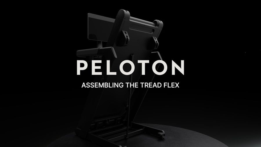
Peloton Tread Flex Assembly
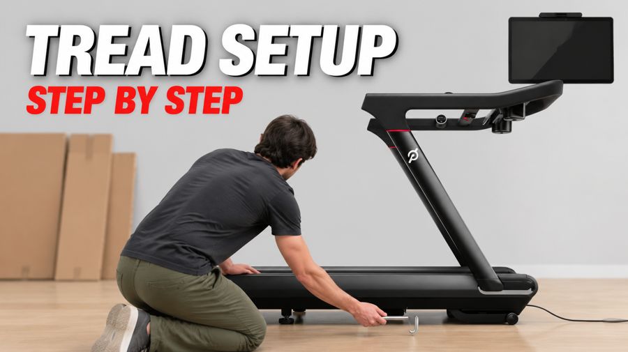
How to Assemble Your Peloton Tread: Full Step-by-Step Setup Guide
“The how-to title matches what a new Tread owner would search for, and the thumbnail shows someone assembling it, making the step-by-step promise clear at a glance.”
This is Peloton's next YouTube video. Write its title and design its thumbnail.

What the video covers:
Length: 00:09:47
Description:
0:00 Disclaimer
0:10 Intro
0:19 Space Requirements
0:38 Unboxing Deck Box
1:35 Unboxing Accessory Box
1:56 Unlocking Stow Bolt
2:15 Installing Uprights
3:17 Installing Handrail
4:04 Fully Tighten Uprights
4:21 Installing Covers
5:03 Installing Neck Assembly
5:18 Installing the Screen
5:56 Installing Water Bottle Holders, Tray and Safety Key
6:11 Deck Leveling
6:51 Connect to Wifi
6:55 Belt Alignment
8:51 Stowing and Locking
9:21 Stowing
Chapters: Disclaimer; Intro; Space Requirements; Unboxing Deck Box; Unboxing Accessory Box; Unlocking Stow Bolt; Installing Uprights; Installing Handrail; Fully Tighten Uprights; Installing Covers; Installing Neck Assembly; Installing the Screen; Installing Water Bottle Holders, Tray and Safety Key; Deck Leveling; Connect to Wifi

Everything known about Peloton (public facts, as of November 19, 2026):

--- brief.md ---
# Peloton (real brand; public facts as of 2026-11-19)

Website: onepeloton.com. Facts below come from the brand's own site, each with the exact words it says.

## What they sell

- An All-Access Membership is required to use all content and features on Peloton hardware. ("Peloton All-Access Membership required to access all Peloton content")
- One All-Access Membership covers one of each type of Peloton hardware per household. ("A single All-Access Membership provides access to Peloton content on one of each type of Peloton hardware")
- Membership standard monthly pricing, accessories, and taxes are charged separately. ("Peloton All-Access Membership (standard monthly pricing), accessories and taxes separate.")
- Peloton Tread+ Vision purchases require a $299 assembly fee. ("Additional required $299 assembly fee with all purchases of Peloton Tread+ Vision.")
- Peloton also sells apparel with instructor-approved styles and performance fabrics. ("Look and train your best with instructor-approved styles, performance fabrics, and exclusive collabs.")

## Who it's for (their words)

- Peloton says it has instructors for whatever members are feeling. ("Whatever you're feeling, there's an expert instructor who lives for it.")
- Classes are built around a community across running, cycling, strength, yoga, and more. ("From running and cycling to strength, yoga, and more, every class is built around a community")
- Peloton IQ is framed as personalized guidance to chase personal bests. ("Get personalized guidance and insights to help you chase your personal bests.")
- Commercial workouts are for people keeping a streak or trying Peloton away from home. ("Keep your streak alive, or try it for the first time with workouts that travel with you.")

## Proof they publish

- Peloton says members can choose from over 10,000 classes. ("Choose from over 10,000 classes across more than 15 workout types")
- Peloton says members can move with millions of other Members. ("Move with millions of Members by your side")
- Named member Jocelyn from Union, NJ is quoted about consistency. ("It's been such a journey learning to respect myself, be consistent, and be my own cheerleader.")
- Named member Marcia from NYC, NY is quoted about feeling proud. ("There's strength in feeling proud that you did the thing you said you were gonna do.")
- Named member Seth from Los Angeles, CA is quoted about showing up. ("When it comes to fitness, success looks like showing up for yourself")

## Offers

- Treads include a 12-month limited warranty plus longer belt, motor, and frame guarantees. ("Includes a 12-month Limited Warranty, a 3-year Belt & Motor Guarantee, and a 5-year Frame Guarantee for Treads.")
- Eligible buyers can pay for equipment with pre-tax HSA or FSA funds through Truemed. ("Use pre-tax funds to pay for your equipment with Truemed.")
- If the home trial is not a fit, Peloton will pick up the equipment and refund the order excluding the return fee. ("If it's not for you, we'll pick it up and refund your order, excluding the return fee.")

## Sources

- https://onepeloton.com/

--- site.md ---
[453 words of Peloton’s homepage text, copied from onepeloton.com on November 19, 2026. Left out of this page because it’s the brand’s own copy.]

--- reviews.md ---
[8 real customer reviews, word for word and cut at 60 words, from Trustpilot. Left out of this page because they’re the customers’ words.]


Rules for this job:
- Customer-facing words use only the facts above (the subject and the brand's facts): nothing invented, facts kept exact.
- The image is made by an image model from your prompt. Describe exactly what's in it. Put any words that appear in the image in quotes, and keep them few.
- No real person's face or likeness, and no celebrities. If the piece needs a person, describe a generic one (an unnamed founder, a customer), never a named, real person. The brand's name may appear as text; no other logos.
- The image model also gets the 1 reference photo(s) of Peloton's real product shown below. When the product appears, refer to them by number in your image prompt ("the wallet from Reference 1") so it's shown exactly as it is. Don't invent product details.
- Return only the fields asked for.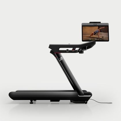
Claude Opus 5.5’s prompt to the image model
YouTube thumbnail, 16:9, clean and bright. The black Peloton treadmill from Reference 1, shown exactly as in the reference (same side-view angle, same frame, handrail, deck, red accent line and screen), placed on the right two-thirds of the frame on a light wood floor in a minimal, softly lit home room with a plain light-gray wall. The treadmill's screen is turned off and shows a plain dark glass surface with no image. In the left foreground, a generic adult seen from behind and to the side, face not visible, kneels next to the base of the treadmill's upright, holding a simple silver hex key toward the base where the upright meets the deck. A few flattened cardboard boxes lean against the wall in the background, slightly blurred. Large bold white sans-serif text with a subtle black drop shadow on the upper left reads "TREAD SETUP", and below it smaller red text reads "STEP BY STEP". No other text, no logos other than what appears on the product in Reference 1, high contrast, sharp focus on the treadmill.
Two pieces of marketing for Peloton on YouTube, about the same subject. One of them will do better with Peloton’s audience: it gets far more views from its title and thumbnail. You see what a customer would see, never the numbers. Which one? Answer A or B; say tie only if you truly can’t separate them. One sentence on why.

[Then each piece: its words, and its image.]
| Judge | Shown as A | Shown as B | Picked | Why, in the judge’s words |
|---|---|---|---|---|
| Gemini 4 Carbon | Peloton’s real one | Opus’s | Opus’s | Item B uses a search-friendly 'How to' title paired with a bright, clear thumbnail showing a person actively assembling the popular flagship Tread alongside bold, readable text, whereas Item A is overly dark and lacks human action. |
| Gemini 4 Carbon | Opus’s | Peloton’s real one | Opus’s | Item A uses a search-friendly 'how-to' title and a bright, high-contrast thumbnail clearly showing a person assembling the machine, making it much easier to find and recognize than B's overly dark image and vague title. |
| GPT-6.2 Astra | Peloton’s real one | Opus’s | Opus’s | The how-to title matches what a new Tread owner would search for, and the thumbnail shows someone assembling it, making the step-by-step promise clear at a glance. |
| GPT-6.2 Astra | Opus’s | Peloton’s real one | Opus’s | A’s how-to title matches what owners would search for, and its thumbnail shows someone working on the Tread, making the promise of step-by-step help clear at a glance. |
Instagram · Ridge
Straight from the clear-tech era. Atomic Purple puts the build on display across Ridge wallets and the magnetic power bank. Limited edition.
Atomic Purple. A transparent shell that shows how it’s built. Available in a limited run for the Ridge Wallet and Magnetic Power Bank.
“[Sol's] bright, vivid hero shot of the transparent purple wallet with a clear title is more striking and legible in-feed than [Ridge's] dark, muted composition, even though [Ridge's] has the nostalgic N64 hook.”
Make Ridge's next Instagram post about the subject below: one image and its caption.

The subject:
- Ridge wallets are sold in an Atomic Purple finish.
- A magnetic power bank comes in that same finish.
- The finish is offered only as a limited run.
- The shell is transparent so the internal construction can be seen.

Everything known about Ridge (public facts, as of November 19, 2026):

--- brief.md ---
# Ridge (real brand; public facts as of 2026-11-19)

Website: ridge.com. Facts below come from the brand's own site, each with the exact words it says.

## What they sell

- Ridge wallets are slim, RFID-blocking, and guaranteed for life. ("Slim, RFID-blocking, Guaranteed for Life")
- Power banks offer 5-in-1 power, MagSafe readiness, and built-in cables. ("5-in-1 Power, MagSafe-ready, cables built in.")
- Hardshell luggage is weatherproof, rugged, and travel-ready. ("Weatherproof, rugged build and travel-ready.")
- Men's rings have a premium build with a lifetime guarantee. ("Premium build, lifetime guarantee included")
- Ridge sells a 24 oz water bottle engineered to outlast. ("Ridge 24 oz Water Bottle Engineered To Outlast")
- MagSafe wallets are described as next-level compatible. ("MagSafe® Wallet Next Level Compatible")
- Vacuum packing sets are sold to fit more in the same bag. ("Vacuum Packing Sets Same Bag, More Room")

## Who it's for (their words)

- The brand speaks to guys as gift recipients. ("For every guy on the list")
- Products are positioned as gear used every day. ("The gear you rely on every day")
- Women's wallets are framed as premium everyday gear. ("Women's Wallets Premium Everyday Gear")
- Men's rings are built for life. ("Men's Rings Built For Life")
- Ridge offers bulk and corporate orders. ("Bulk & Corporate Orders Personal Touch. Premium Gear.")
- Backpacks and bags are purpose-built for adventure. ("Backpack & Bags Purpose-Built For Adventure")

## Offers

- Shoppers can return an item for a full refund if it is not as promised. ("Live with it. If it's not everything we promised, return it for a full refund.")
- Products are backed by a lifetime warranty. ("Made to last, backed by a promise that never fades.")
- Shipping is fast and free, with no added fees. ("Delivered swiftly, carefully, and without added fees.")
- Gear is guaranteed for life. ("Overbuilt. Guaranteed for life. Used every day.")

## Sources

- https://ridge.com/
- https://ridge.com/products/magnetic-power-bank-matte-black

--- site.md ---
[440 words of Ridge’s homepage text, copied from ridge.com on November 19, 2026. Left out of this page because it’s the brand’s own copy.]

--- reviews.md ---
[2 real customer reviews, word for word and cut at 60 words, from Trustpilot. Left out of this page because they’re the customers’ words.]


Rules for this job:
- Customer-facing words use only the facts above (the subject and the brand's facts): nothing invented, facts kept exact.
- The image is made by an image model from your prompt. Describe exactly what's in it. Put any words that appear in the image in quotes, and keep them few.
- No real person's face or likeness, and no celebrities. If the piece needs a person, describe a generic one (an unnamed founder, a customer), never a named, real person. The brand's name may appear as text; no other logos.
- The image model also gets the 3 reference photo(s) of Ridge's real product shown below. When the product appears, refer to them by number in your image prompt ("the wallet from Reference 1") so it's shown exactly as it is. Don't invent product details.
- Return only the fields asked for.GPT-6.2 Sol’s prompt to the image model
Create a single 4:5 Instagram product photograph. Show only the front-facing wallet from Reference 1, centered and rotated slightly clockwise in a tight three-quarter view. Preserve its exact silhouette, proportions, screw positions, thumb cutout, and layered edge. Change only the gunmetal shell to transparent Atomic Purple, letting the existing construction show through without adding any components or decorative patterns. Use a seamless matte charcoal background and a soft white strip light from the upper left to reveal the shell’s transparency without washing out the purple. Leave clean negative space above the wallet for the small, white, uppercase headline "ATOMIC PURPLE". Keep the original "RIDGE" wordmark on the wallet. No other text, logos, props, or people.
Two pieces of marketing for Ridge on Instagram, about the same subject. One of them will do better with Ridge’s audience: it gets far more plays and likes. You see what a customer would see, never the numbers. Which one? Answer A or B; say tie only if you truly can’t separate them. One sentence on why.

[Then each piece: its words, and its image.]
| Judge | Shown as A | Shown as B | Picked | Why, in the judge’s words |
|---|---|---|---|---|
| Claude Fable 5.2 | Ridge’s real one | Sol’s | Sol’s | B's bright, crisp hero shot of the vivid translucent purple wallet with a clear product name is more eye-catching and instantly readable than A's dark, muted, cluttered image. |
| Claude Fable 5.2 | Sol’s | Ridge’s real one | Sol’s | A's bright, vivid hero shot of the transparent purple wallet with a clear title is more striking and legible in-feed than B's dark, muted composition, even though B has the nostalgic N64 hook. |
| Gemini 4 Carbon | Ridge’s real one | Sol’s | Sol’s | Item B's vibrant, studio-lit 3D presentation makes the translucent purple color pop immediately on the feed with clear on-screen text, whereas Item A looks dark and muted while obscuring the wallet against the controller beneath it. |
| Gemini 4 Carbon | Sol’s | Ridge’s real one | Sol’s | Item A serves as a vibrant, high-contrast hero reveal that makes the translucent purple color pop instantly in the feed, whereas Item B is dimly lit, muted in color, and obscures the wallet's signature look. |
Meta ads · Grammarly
Work faster and smarter with an AI assistant that supports you at every step. Headline: Your AI writing assistant Button: Sign up
Grammarly is your AI writing partner, helping you through every stage of your work so you get things done faster and better. Jayesh J., an MBA student, says Grammarly lets him send messages with confidence because his writing looks polished. Trusted by 50,000 organizations and 40 million people. Sign up and get Grammarly today. Headline: Hit send with confidence. Sign up free. Button: Sign Up
“[Opus's ad] shows how a tone suggestion can make a work message sound more confident, giving readers a concrete reason to sign up free that [Grammarly's] testimonial alone doesn’t provide.”
Make one Meta ad (Facebook and Instagram feed) for Grammarly about the subject below.

The subject:
- The product shown is Grammarly.
- It is presented as an automated helper for composing text.
- It is said to assist people through each stage of their work so tasks get done sooner and more effectively.
- A quoted user named Jayesh J. is identified as an MBA student.
- He credits the tool with letting him send messages confidently because the wording appears polished.
- Readers are prompted to register and obtain the product now.

Everything known about Grammarly (public facts, as of November 19, 2026):

--- brief.md ---
# Grammarly (real brand; public facts as of 2026-11-19)

Website: grammarly.com. Facts below come from the brand's own site, each with the exact words it says.

## What they sell

- The Free plan is described as mistake-free writing. ("Get peace of mind with writing that's mistake-free.")
- Free includes 100 AI prompts for generating text. ("Generate text with 100 AI prompts")
- Pro includes 2,000 AI prompts for generating text. ("Generate text with 2,000 AI prompts")
- Pro is billed per member per month annually, or €30 when billed monthly. ("/ member / month, billed annually**€30** when billed monthly")
- Pro can rewrite full sentences with a click. ("Rewrite full sentences with a click")
- Pro can detect plagiarism and AI-generated text. ("Detect plagiarism and AI generated text")
- Enterprise Grammarly is available through Superhuman Go. ("Drive results across your organization with Grammarly, available through Superhuman Go.")

## Who it's for (their words)

- Grammarly presents itself as an AI partner for clear, credible writing. ("Work with an AI partner that helps turn your thoughts into writing that's clear, credible, and impossible to ignore.")
- Suggestions are for writing for yourself or for your brand. ("whether writing for yourself or your brand.")
- The product is framed for professional, clear, convincing writing in a few clicks. ("Be perfectly professional, clear, and convincing in a few clicks, not a few hours.")
- Pro is described for people working alone or as a team. ("Deliver impactful writing, whether working alone or as a team.")
- On the plans page, Pro is for eligible individuals and teams. ("For eligible individuals and teams")

## Proof they publish

- Grammarly says it is trusted by 50,000 organizations and 40 million people. ("Trusted by 50,000 organizations and 40 million people")
- Organizations that deploy Grammarly save an average of $5,000 per employee per year. ("Organizations that deploy Grammarly save an average of $5,000 per employee per year.")
- Grammarly calls itself the AI writing leader for more than a decade. ("Work smarter with the AI writing leader for more than a decade.")
- A customer used to spend 20-30 hours a week reviewing, rewriting, and coaching. ("I used to spend 20-30 hours a week reviewing, rewriting, and coaching.")
- A customer said Grammarly cut that review work by at least half. ("Grammarly has cut that by at least half, and that's allowed my team to scale without scaling.")
- A customer said Grammarly reduces time spent reviewing written work. ("Grammarly reduces the time our team spends reviewing written work.")
- Grammarly cites a SOC 2 Type 2 report for security, privacy, availability, and confidentiality. ("Grammarly's SOC 2 (Type 2) report attests to our enterprise-grade system and organization controls regarding security, privacy, availability, and confidentiality.")

## Offers

- Pro can be tried for €0 today. ("Try Pro for €0 today")

## Sources

- https://grammarly.com/
- https://www.grammarly.com/plans

--- site.md ---
[443 words of Grammarly’s homepage text, copied from grammarly.com on November 19, 2026. Left out of this page because it’s the brand’s own copy.]

--- reviews.md ---
[8 real customer reviews, word for word and cut at 60 words, from Trustpilot. Left out of this page because they’re the customers’ words.]


Rules for this job:
- Customer-facing words use only the facts above (the subject and the brand's facts): nothing invented, facts kept exact.
- The image is made by an image model from your prompt. Describe exactly what's in it. Put any words that appear in the image in quotes, and keep them few.
- No real person's face or likeness, and no celebrities. If the piece needs a person, describe a generic one (an unnamed founder, a customer), never a named, real person. The brand's name may appear as text; no other logos.
- The image model also gets the 3 reference photo(s) of Grammarly's real product shown below. When the product appears, refer to them by number in your image prompt ("the wallet from Reference 1") so it's shown exactly as it is. Don't invent product details.
- Return only the fields asked for.
Claude Opus 5.5’s prompt to the image model
Square 1:1 clean product graphic for a social feed ad. Background: the soft blue-to-periwinkle gradient with faint dot grid from Reference 2. Center foreground: the Tone Suggestion card from Reference 2, shown exactly as it is (the 'Confident' label with the handshake emoji slider, the sentence 'I have an idea that should improve campaign performance.' with its purple highlighted words, the green 'Accept' button and 'Dismiss'), large and crisp with a subtle soft shadow. Slightly behind it, offset to the lower right and partially overlapped, the 'Fix grammar and spelling' card from Reference 3, shown exactly as it is, smaller and slightly faded for depth. No people, no devices, no other logos. Above the cards, in a clean bold dark sans-serif headline: "Send it with confidence." Small 'Grammarly' wordmark text in the bottom left corner in dark green. Minimal, bright, modern, plenty of breathing room.
Two pieces of marketing for Grammarly on Facebook and Instagram feed ads, about the same subject. One of them will do better with Grammarly’s audience: the advertiser would keep it running because it wins customers. You see what a customer would see, never the numbers. Which one? Answer A or B; say tie only if you truly can’t separate them. One sentence on why.

[Then each piece: its words, and its image.]
| Judge | Shown as A | Shown as B | Picked | Why, in the judge’s words |
|---|---|---|---|---|
| Gemini 4 Carbon | Grammarly’s real one | Opus’s | Opus’s | Item B visually demonstrates how the product actually works through clear UI mockups, pairs a strong benefit-driven visual headline with strong social proof, and explicitly highlights that signing up is free. |
| Gemini 4 Carbon | Opus’s | Grammarly’s real one | Opus’s | Ad A visually demonstrates how the product actually works with clear UI examples, highlights that signing up is free, and backs its claims with massive social proof. |
| GPT-6.2 Astra | Grammarly’s real one | Opus’s | Opus’s | B shows how a tone suggestion can make a work message sound more confident, then gives viewers a clear invitation to try Grammarly for free. |
| GPT-6.2 Astra | Opus’s | Grammarly’s real one | Opus’s | A shows how a tone suggestion can make a work message sound more confident, giving readers a concrete reason to sign up free that B’s testimonial alone doesn’t provide. |
Instagram · Glossier
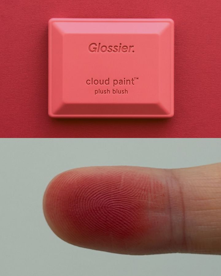
Puts the plush in Cloud Paint Plush Blush
Top-rated: Cloud Paint Plush Blush 🌸 We believe beauty is about having fun, celebrating freedom, and being present. Pick a compact (or a few) and see where the day takes you. No matter where you are in your beauty journey, you look good. Right now: up to 30% off sitewide, plus a free gift on qualifying orders. Free standard shipping on orders $40+.
Cloud Paint Plush Blush. Top-rated.
Top-rated Cloud Paint Plush Blush. Made with our Skin First ethos and inspired by real life, because we believe beauty is about having fun, celebrating freedom, and being present. No matter where you are in your beauty journey, you look good. Shop now at glossier.com for up to 30% off sitewide, plus a free gift on qualifying orders and free standard shipping on orders $40+.
“The fingertip swatch makes “plush” feel tangible at a glance, and the playful one-liner fits Glossier’s Instagram voice better than [Gemini's] lengthy sales pitch.”
Make Glossier's next Instagram post about the subject below: one image and its caption.

The subject:
Glossier Cloud Paint Plush Blush
A blush product

Everything known about Glossier (public facts, as of November 19, 2026):

--- brief.md ---
# Glossier (real brand; public facts as of 2026-11-19)

Website: glossier.com. Facts below come from the brand's own site, each with the exact words it says.

## What they sell

- Glossier You eau de parfum is offered in 8 ml, 50 ml, and 100 ml sizes. ("8 ml, 50 ml, 100 ml")
- Glossier You 100 ml is listed at €155. ("Add to bag  €155  Notify me  €155")
- Glossier You is described as a soft, warm, familiar skin-scent fragrance. ("Glossier You is a soft, warm and familiar skin-scent enhancing fragrance.")
- Purchases of Glossier You are limited to 5 per customer. ("Limited to 5 per customer")
- Boy Brow grooming pomade in Dark Brown is priced at €29. ("Boy Brow

Grooming pomade

Dark Brown

€29")
- Lash Slick film-form mascara in Black is priced at €26. ("Lash Slick

Film form mascara

Black

€26")
- Balm Dotcom nourishing lip balm is priced at €21. ("Balm Dotcom

Nourishing lip balm

NEW  Just Baked

€21")

## Who it's for (their words)

- Glossier makes products inspired by real life and a skin-first ethos. ("we make products inspired by real life, embracing the ethos of Skin First.")
- The brand says beauty is about fun, freedom, and being present. ("We believe beauty is about having fun, celebrating freedom, and being present.")
- It speaks to people at any point in a beauty journey. ("No matter where you are in your beauty journey, you look good.")
- Custom skincare sets are positioned for people meeting skin goals. ("Create a Custom Skincare Set to meet your skin goals")
- Body products are framed as an upgrade to a body care routine. ("Upgrade your body care routine")

## Proof they publish

- Glossier You is marked as a best seller. ("Coming soon 30% Off Best Seller")
- Cloud Paint Plush Blush is labeled top-rated. ("Top-rated

###   Cloud Paint Plush Blush")
- A Glossier You review is rated 5 out of five stars. ("5 out of five stars")
- A reviewer says people who smell good are always wearing Glossier. ("Whenever people smell good, it's _always_ Glossier.")
- The five-star review is attributed to Jade at Glossier HQ. ("it's _always_ Glossier."


Jade, Glossier HQ")

## Offers

- Standard shipping is free on orders of $40 or more. ("Free standard shipping on orders $40+")
- In Germany, shipping is free on orders over €65. ("Free shipping on orders over €65 EUR")
- In Germany, express shipping is free on orders over €130. ("Free express shipping on orders over €130 EUR")
- Duties and taxes are included for shoppers in Germany. ("Duties and taxes are included.")
- Germany shoppers are offered easy 30-day returns. ("Free express shipping on orders over €130 EUR
  * Easy, 30-day returns.")

## Sources

- https://glossier.com/
- https://glossier.com/en-de/products/glossier-you

--- site.md ---
[410 words of Glossier’s homepage text, copied from glossier.com on November 19, 2026. Left out of this page because it’s the brand’s own copy.]

--- reviews.md ---
[8 real customer reviews, word for word and cut at 60 words, from Trustpilot. Left out of this page because they’re the customers’ words.]


Rules for this job:
- Customer-facing words use only the facts above (the subject and the brand's facts): nothing invented, facts kept exact.
- The image is made by an image model from your prompt. Describe exactly what's in it. Put any words that appear in the image in quotes, and keep them few.
- No real person's face or likeness, and no celebrities. If the piece needs a person, describe a generic one (an unnamed founder, a customer), never a named, real person. The brand's name may appear as text; no other logos.
- The image model also gets the 3 reference photo(s) of Glossier's real product shown below. When the product appears, refer to them by number in your image prompt ("the wallet from Reference 1") so it's shown exactly as it is. Don't invent product details.
- Return only the fields asked for.
Claude Opus 5.5’s prompt to the image model
Bright, airy overhead flat-lay product photo on a soft milky-pink seamless background with gentle natural daylight and soft shadows. The Glossier Cloud Paint Plush Blush compacts from Reference 3 are arranged in a loose, playful scatter, shown exactly as they appear in Reference 3: the same rectangular compacts in the same colors (rose, peach, bright pink, coral, lilac, berry), with the same embossed "Glossier." and "cloud paint plush blush" lettering on the lids. Several compacts are open with their lids flipped back, showing the blush pans inside exactly as in Reference 3. Do not add or change any product details, shades, packaging shapes, or labels. Clean, minimal, modern beauty aesthetic with a lot of breathing room. In the upper left corner, small clean sans-serif text in white reads "Top-rated". No people, no other logos, no other text.
GPT-6.2 Sol’s prompt to the image model
Create one 4:5 vertical Instagram still life shot from directly overhead. Show exactly three Glossier Cloud Paint Plush Blush compacts from Reference 3: the open vivid red compact from the upper right, the closed dusty rose compact from the upper left, and the closed coral compact from the bottom center. Match their packaging, proportions, colors, and the red compact’s lid angle and visible pan exactly. Arrange them in a loose triangle on a seamless pale pink backdrop, with the open red compact just above center and the two closed compacts offset below it. Leave a small gap between each compact. Use direct studio light from the upper left to cast clean, short shadows. Keep only the original packaging text: “Glossier.”, “cloud paint™”, and “plush blush”. No overlay text, props, people, or products from References 1 and 2.
Gemini 4 Neon’s prompt to the image model
Vertical 4:5 editorial product photograph in natural morning sunlight, featuring five of the rectangular beveled Glossier Cloud Paint Plush Blush compacts from Reference 3 arranged artfully on a clean, smooth off-white ceramic vanity countertop. The bright coral-red compact from Reference 3 sits open in the foreground at a slight angle, displaying its smooth rectangular blush pan inside the white inner frame. Beside it, the soft baby pink compact from Reference 3 rests open, and the deep berry compact from Reference 3 sits partially open nearby. Next to them, the closed bright pink and dusty rose compacts from Reference 3 are casually stacked, clearly showing the printed "Glossier." and "cloud paint" text on their lids exactly as seen in Reference 3. Warm directional sunlight streams across the scene from the left, casting crisp, airy shadows across the countertop and subtle light reflections against soft-focus glossy white wall tiles in the background. In the softly blurred edge of the frame, the corner of a clean pale pink cotton towel adds a real-life morning routine feel. Captured with a natural medium-format film aesthetic, sharp focus on the compacts, true-to-life colors, minimal and bright composition, with no added graphics, no extra text, and no other logos.
Two pieces of marketing for Glossier on Instagram, about the same subject. One of them will do better with Glossier’s audience: it gets far more plays and likes. You see what a customer would see, never the numbers. Which one? Answer A or B; say tie only if you truly can’t separate them. One sentence on why.

[Then each piece: its words, and its image.]
| Judge | Shown as A | Shown as B | Picked | Why, in the judge’s words |
|---|---|---|---|---|
| Claude Fable 5.2 | Glossier’s real one | Gemini’s | Glossier’s real one | A's short, playful caption and striking close-up texture shot of the fingerprint swatch feels native and intriguing, while B reads like a generic promotional ad with a long sales-heavy caption. |
| Claude Fable 5.2 | Gemini’s | Glossier’s real one | Glossier’s real one | B's short, playful caption and striking tactile close-up of the fingerprint swatch feel like native Glossier content, while A reads as a sales ad with promo-heavy copy that typically draws less organic engagement. |
| GPT-6.2 Astra | Glossier’s real one | Gemini’s | Glossier’s real one | The fingertip swatch makes “plush” feel tangible at a glance, and the playful one-liner fits Glossier’s Instagram voice better than B’s lengthy sales pitch. |
| GPT-6.2 Astra | Gemini’s | Glossier’s real one | Glossier’s real one | The fingertip swatch makes the blush’s texture almost tangible, and the playful one-line caption feels more at home on Instagram than A’s sales pitch. |
| Claude Fable 5.2 | Glossier’s real one | Sol’s | Glossier’s real one | The close-up fingertip swatch paired with the compact shows texture and pigment in a tactile, scroll-stopping way with a playful caption, whereas B is a generic product flat lay with a bland 'top-rated' line. |
| Claude Fable 5.2 | Sol’s | Glossier’s real one | Glossier’s real one | The macro fingertip swatch shows the actual texture and pigment in a tactile, distinctive way with a playful caption, which is more engaging than a standard product flat-lay with a generic 'top-rated' line. |
| Gemini 4 Carbon | Glossier’s real one | Sol’s | Glossier’s real one | The tactile finger swatch visual paired with playful copy feels much more organic, satisfying, and native to Glossier's aesthetic than Item B's generic, ad-like 'Top-rated' framing. |
| Gemini 4 Carbon | Sol’s | Glossier’s real one | Glossier’s real one | Item B uses a playful, native caption and a tactile, sensory split-screen visual showing the blush's bouncy texture on skin, which resonates much better on Instagram than Item A's generic ad-style copy and standard product flatlay. |
| Gemini 4 Carbon | Glossier’s real one | Opus’s | Glossier’s real one | Item A uses a punchy, organic caption and a satisfying, tactile visual of the product's texture, whereas Item B reads and looks like a generic promotional sale ad that audiences typically scroll past. |
| Gemini 4 Carbon | Opus’s | Glossier’s real one | Glossier’s real one | Item B uses a satisfying, sensory texture shot and a punchy organic caption that resonates strongly with beauty enthusiasts, whereas Item A reads and looks like a standard promotional sale ad that audiences typically scroll past. |
| GPT-6.2 Astra | Glossier’s real one | Opus’s | Glossier’s real one | The fingertip swatch makes the blush’s color and texture almost tangible at a glance, while B feels more like a sale ad. |
| GPT-6.2 Astra | Opus’s | Glossier’s real one | Glossier’s real one | The close-up fingertip swatch makes “plush” feel tangible, and the fingerprint emoji playfully echoes the image in a way A’s sale copy doesn’t. |
| Claude Fable 5.2 | Gemini’s | Sol’s | Gemini’s | A's warm, sunlit bathroom scene showing multiple open shades feels more lifestyle and tactile than B's flat studio shot, and its caption adds a concrete sale incentive that gives viewers more reason to engage. |
| Claude Fable 5.2 | Sol’s | Gemini’s | Gemini’s | B's sunlit bathroom lifestyle shot with multiple open shades feels more native and tactile than A's flat studio product shot, and its caption adds a concrete sitewide discount and free gift offer that gives the audience a reason to engage. |
| GPT-6.2 Astra | Gemini’s | Opus’s | Opus’s | B’s colorful lineup makes it fun to pick a favorite shade, and the on-image “Top-rated” cue gives scrollers a reason to pause before they even read the caption. |
| GPT-6.2 Astra | Opus’s | Gemini’s | Opus’s | The colorful spread of compacts invites viewers to pick a favorite shade at a glance, and the playful, easy-to-skim caption reinforces that invitation. |
| Gemini 4 Carbon | Sol’s | Opus’s | Sol’s | Item A uses a clean, editorial-style product shot and a minimalist caption that fits Glossier's signature organic Instagram aesthetic, whereas Item B reads and looks like a cluttered promotional ad. |
| Gemini 4 Carbon | Opus’s | Sol’s | Sol’s | Item B uses Glossier's signature minimalist, editorial aesthetic and punchy organic caption, whereas Item A reads and looks like a cluttered promotional ad with discount copy and text overlay that audiences typically scroll past. |
Client-ready checks
Every AI piece was checked before judging. Two judges from other labs looked for any claim the brand’s facts don’t back, in the words or drawn into the image; a piece fails only when both find the same one and the quote is really there. When a model used the brand’s product photos, two judges checked the product was drawn as it really is. Code checked platform limits.
| Check | Opus | Sol | Gemini |
|---|---|---|---|
| Every claim backed by the brand’s facts | 99% | 100% | 100% |
| Product drawn as it really is | 98% | 97% | 98% |
| Text fits the platform (not cut off) | 51% | 74% | 39% |
For comparison, the brands’ own pieces fit the platform 71% of the time. Em dashes per 100 words: Opus 0.00, Sol 0.16, Gemini 0.82; the brands 0.22. The one honesty failure: the image model printed 5.5 oz on a bag that really says 4 oz.
Reading the market
Before choosing the judges, we tested them. Each model saw 106 real pairs of posts, ads, videos and pages, one of which won with real customers, and had to pick it in both orders. Only models that beat a simple rule got to judge.
Grok 4.7 scored like a coin flip, and Kimi K3.1 Pro didn’t beat the rule either. GPT-6.2 Sol makes the best social posts here but is the weakest of the three contestants at telling which real piece will win.
How we ran it
The brands: Canva, ClickUp, Descript, ElevenLabs, Figma, Fly By Jing, Framer, Glossier, Grammarly, Granola, HubSpot, Huel, Kosas, Linear, Lovable, Miro, Notion, Our Place, Peloton, Perplexity, Raycast, Replit, Retool, Rhode, Ridge, Runway, Siete, Skims, Solo Stove, Supabase, Tower 28, True Classic, Vercel, WHOOP, Zapier. AI pieces shown here are test material, not made by or for these brands.
All numbers on this page: data.json.
Real pairs, real results. Ten rounds, about two minutes, no sign-up.